Chapter 6 Data Visualization
Visualization is one of the most powerful tools for understanding data and communicating findings. A well-designed chart can reveal patterns, trends, and outliers that are invisible in tables of numbers. This chapter provides a comprehensive introduction to data visualization in R using ggplot2, the most widely used graphics package in the R ecosystem.
6.1 The Grammar of Graphics
ggplot2 is built on the “grammar of graphics”—a systematic way of describing and building visualizations. Every ggplot2 chart is constructed from the same components:
- Data: The dataset you’re visualizing
- Aesthetics (aes): Mappings from data variables to visual properties (x position, y position, color, size, shape)
- Geometries (geom): The visual elements that represent data (points, lines, bars)
- Scales: How data values map to aesthetic values
- Facets: Splitting data into subplots
- Themes: Overall visual appearance
The basic template for any ggplot is:
6.2 Scatter Plots
Scatter plots display the relationship between two continuous variables by plotting individual observations as points on a coordinate plane. Each point represents one observation, with its position determined by the values of two variables. Scatter plots are essential for exploring correlations, identifying patterns, and detecting outliers in your data.
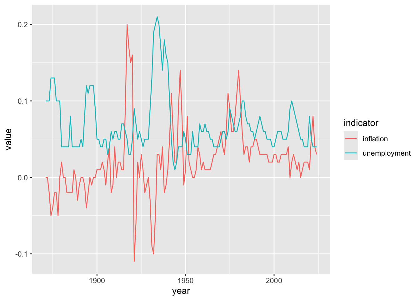
In economics, scatter plots are fundamental for examining relationships between variables. The classic example is the Phillips Curve, which plots unemployment against inflation to explore the hypothesized tradeoff between these two macroeconomic outcomes. Scatter plots can reveal whether relationships are positive, negative, linear, or nonlinear. They also make it easy to spot unusual observations that might warrant further investigation—such as years with stagflation (high unemployment and high inflation simultaneously) that deviate from typical patterns. By adding trend lines, you can visualize the average relationship and assess how well a linear model fits the data.
6.2.1 Basic Scatter Plot
# Unemployment vs. inflation (Phillips Curve)
ggplot(macro, aes(x = unemployment, y = inflation)) +
  geom_point()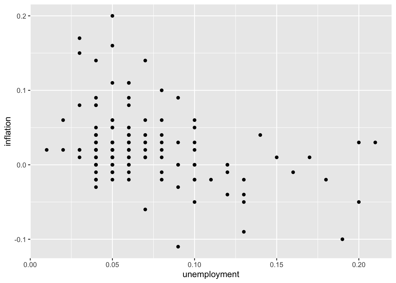
6.2.2 Adding Color
Map a variable to color to add a third dimension:
# Color by decade
macro <- macro %>%
  mutate(decade = factor(floor(year / 10) * 10))

ggplot(macro, aes(x = unemployment, y = inflation, color = decade)) +
  geom_point()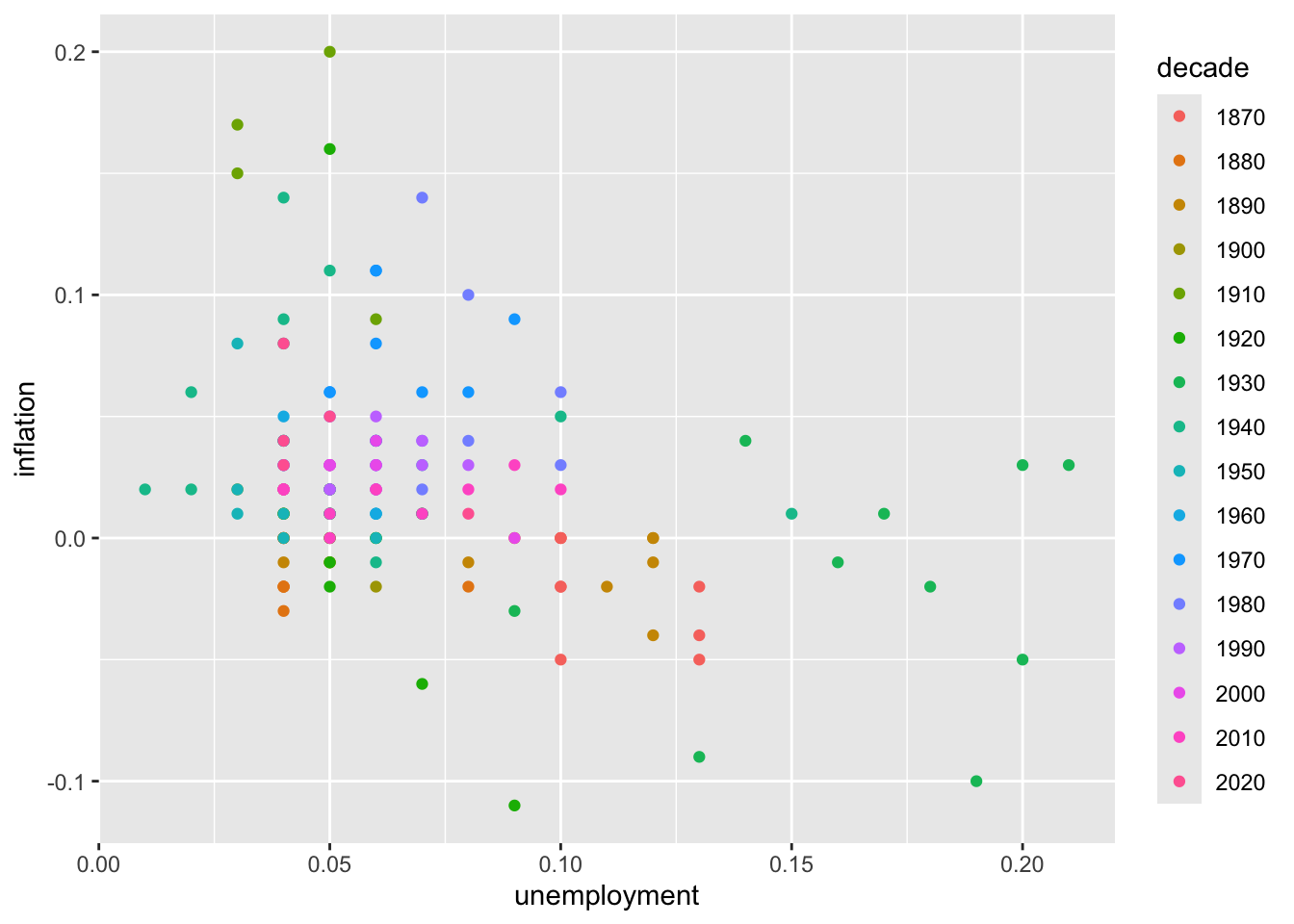
6.2.3 Adjusting Point Size and Transparency
# Larger, semi-transparent points
ggplot(macro, aes(x = unemployment, y = inflation)) +
  geom_point(size = 3, alpha = 0.6)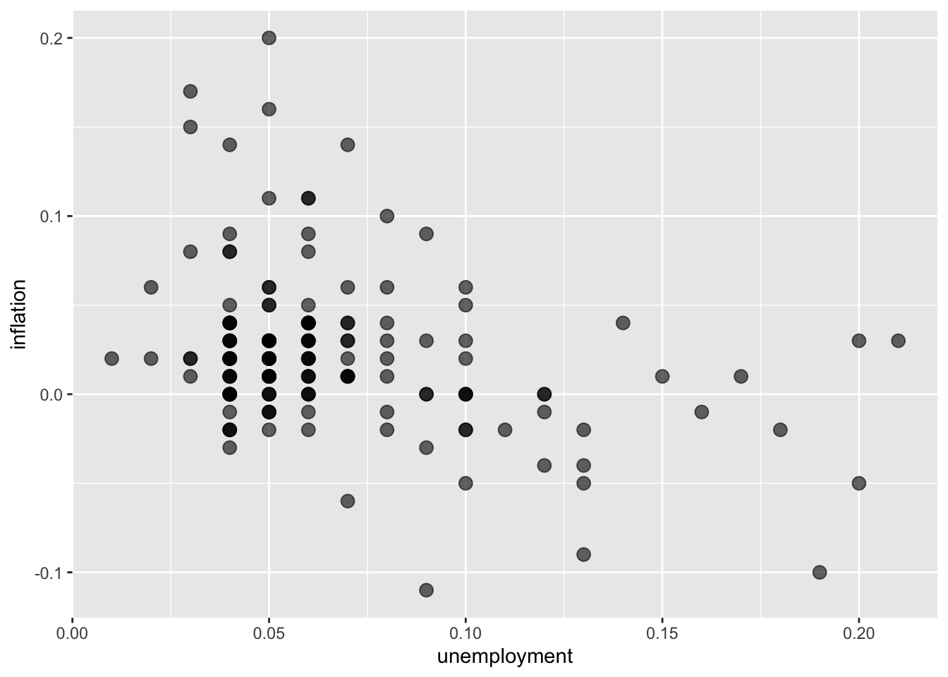
# Size mapped to a variable
ggplot(macro, aes(x = unemployment, y = inflation, size = realgdp_percap)) +
  geom_point(alpha = 0.5)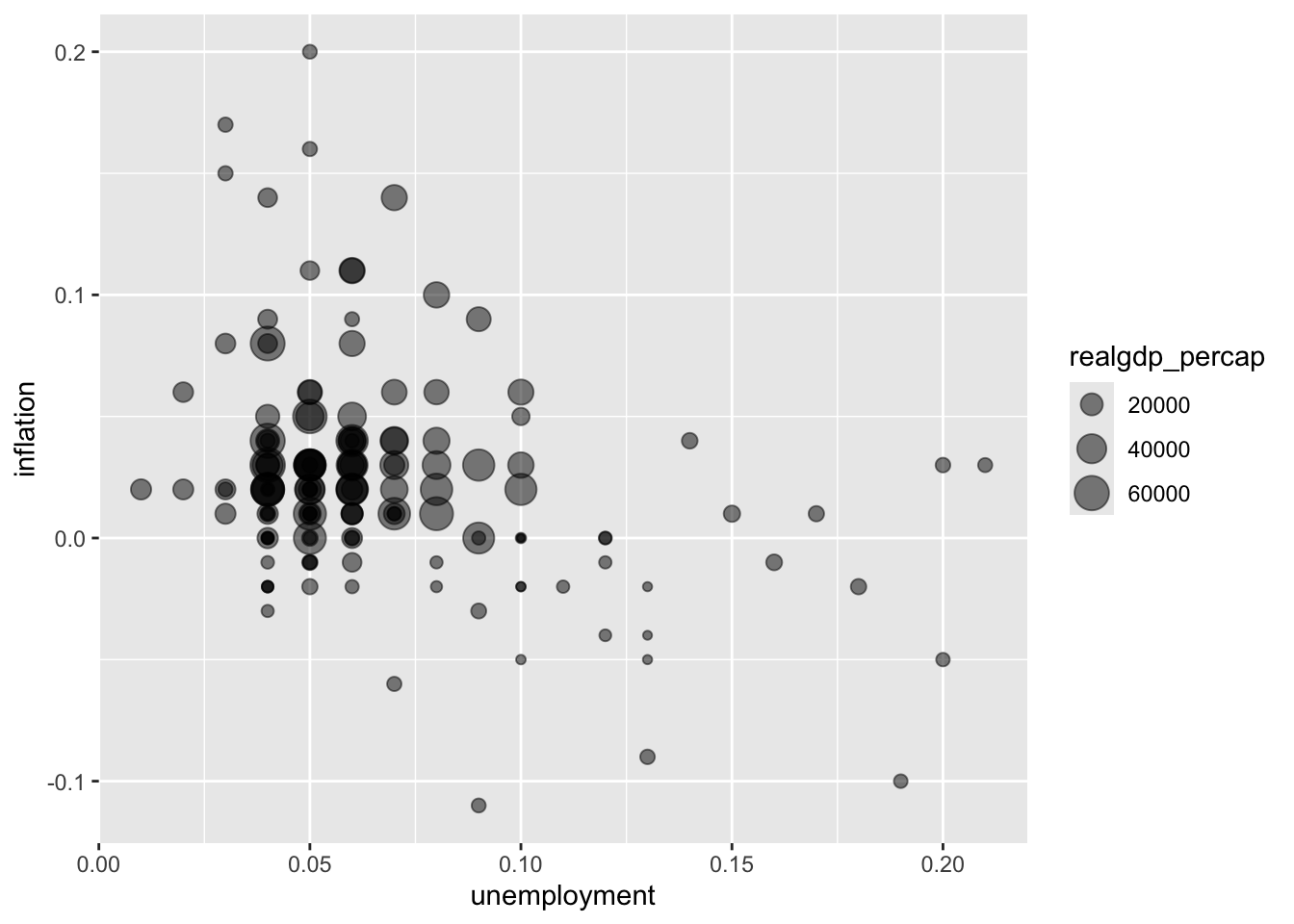
6.2.4 Adding a Trend Line
# Linear trend line
ggplot(macro, aes(x = unemployment, y = inflation)) +
  geom_point() +
  geom_smooth(method = "lm")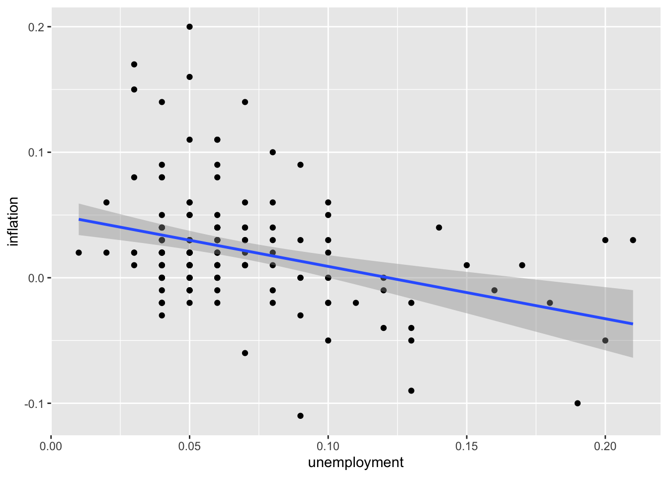
# Smooth (LOESS) trend line
ggplot(macro, aes(x = unemployment, y = inflation)) +
  geom_point() +
  geom_smooth(method = "loess")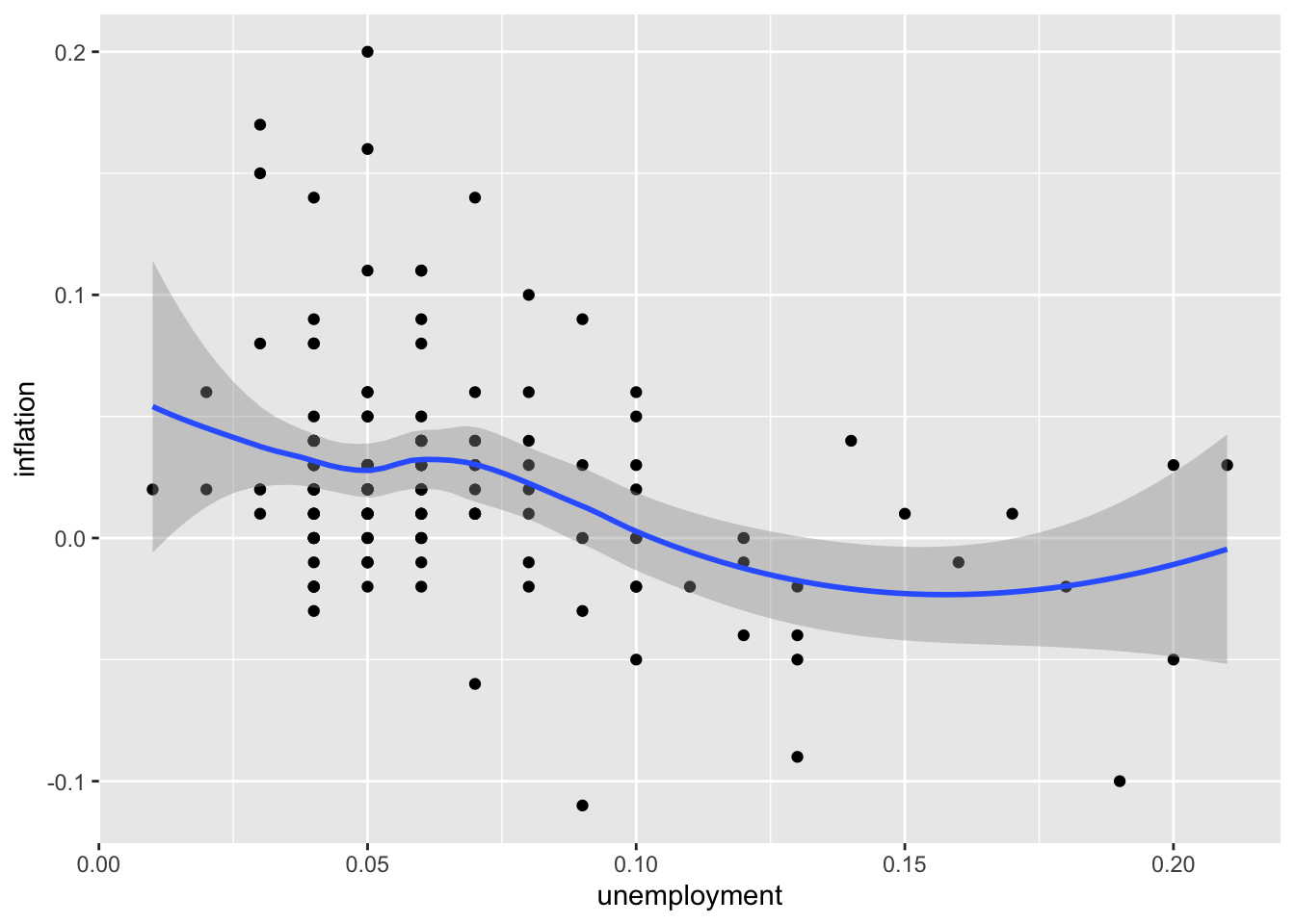
# Trend line without confidence interval
ggplot(macro, aes(x = unemployment, y = inflation)) +
  geom_point() +
  geom_smooth(method = "lm", se = FALSE)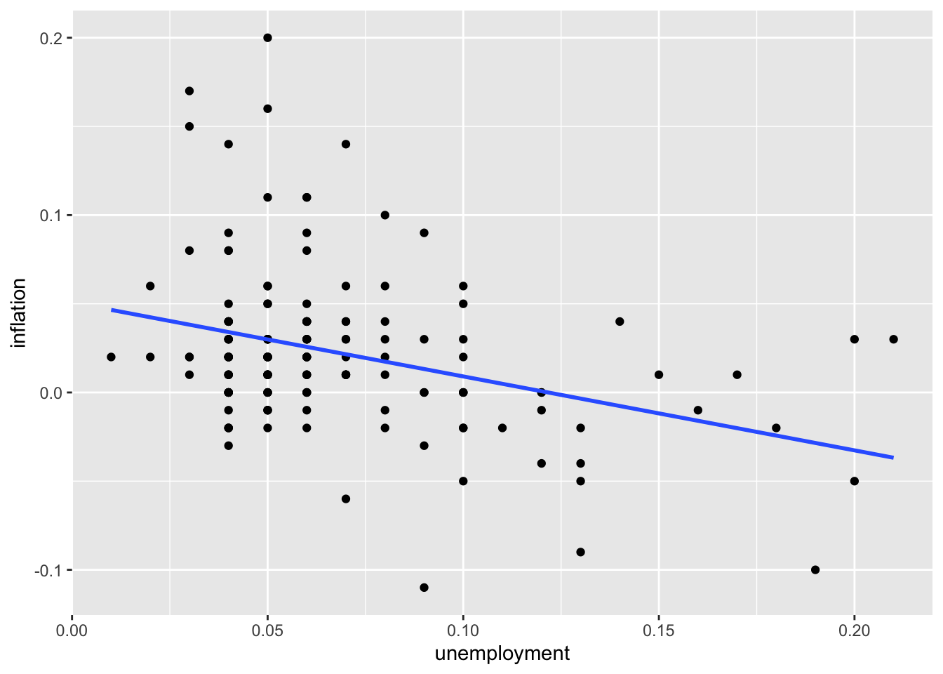
6.3 Line Plots
Line plots connect data points with lines, making them ideal for displaying how variables change over a continuous dimension—most commonly time. The connected lines emphasize the sequential nature of the data and make trends, cycles, and turning points visually apparent. Unlike scatter plots, which treat each observation independently, line plots convey continuity and flow.
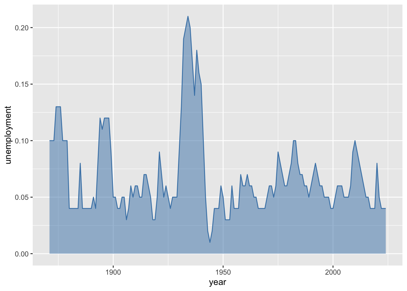
For economic analysis, line plots are indispensable because so much of economics involves understanding change over time. GDP growth, unemployment rates, inflation, stock prices, and interest rates are all naturally understood as time series. Line plots reveal business cycles (expansions and recessions), long-term trends (economic growth), structural breaks (policy changes or shocks), and seasonal patterns. When comparing multiple economic indicators on the same plot, line charts make it easy to see whether variables move together, move inversely, or lead and lag each other. Area plots—a variant that fills the space beneath the line—can emphasize the cumulative magnitude of a variable over time.

6.3.2 Customizing Lines
# Thicker line with color
ggplot(macro, aes(x = year, y = unemployment)) +
  geom_line(color = "steelblue", linewidth = 1)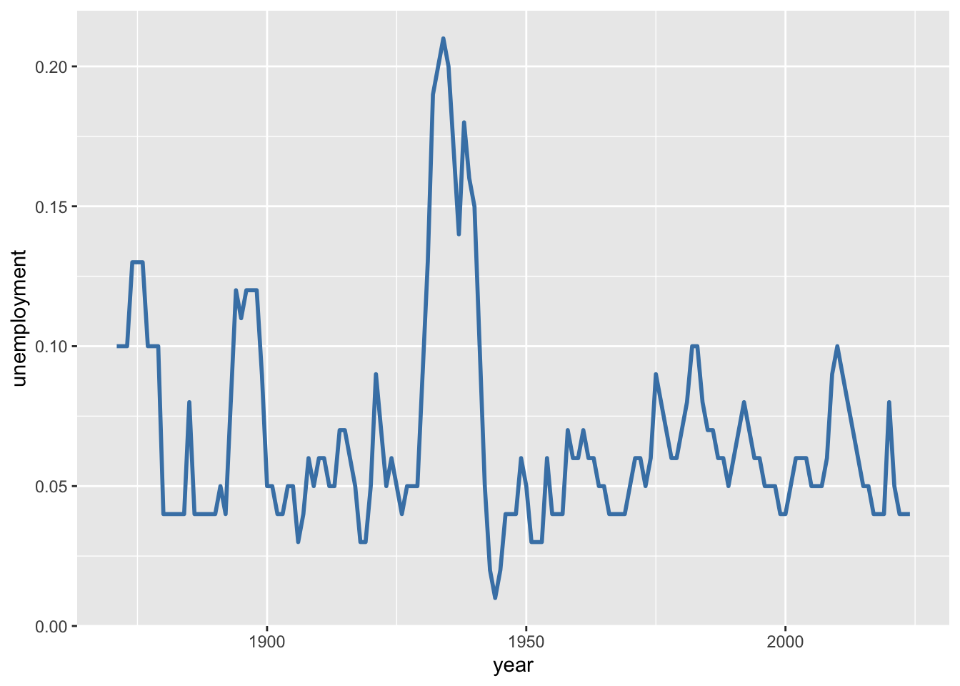
# Line with points
ggplot(macro %>% filter(year >= 2000), aes(x = year, y = unemployment)) +
  geom_line(color = "steelblue") +
  geom_point(color = "steelblue")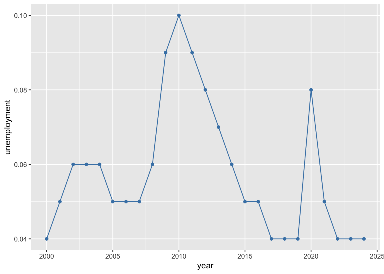
6.4 Bar Charts
Bar charts use rectangular bars to represent values, with the length or height of each bar proportional to the quantity it represents. They excel at comparing discrete categories, making differences in magnitude immediately visible. Unlike line plots, bar charts do not imply continuity between categories—each bar stands independently.
In economic applications, bar charts are useful for comparing summary statistics across groups. You might compare average GDP growth rates across countries, unemployment rates across demographic groups, or government spending across budget categories. Bar charts work well for showing rankings (which president had the highest average inflation?) and for displaying the results of grouped calculations. Grouped and stacked bar charts extend this further by allowing comparisons across two categorical dimensions simultaneously—for example, comparing both inflation and unemployment across decades. When categories have long labels (like country names or policy descriptions), horizontal bar charts improve readability by giving the labels room to display fully.
6.4.1 Basic Bar Chart
# Average inflation by president (post-1950)
president_inflation <- macro %>%
  filter(year >= 1950) %>%
  group_by(president) %>%
  summarize(avg_inflation = mean(inflation, na.rm = TRUE)) %>%
  arrange(desc(avg_inflation))

ggplot(president_inflation, aes(x = president, y = avg_inflation)) +
  geom_col()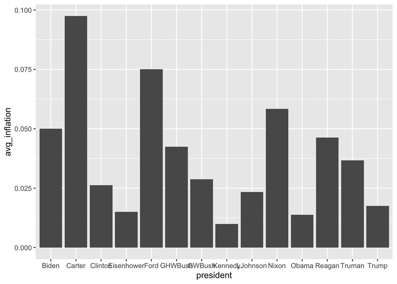
6.4.2 Reordering Bars
# Order by value instead of alphabetically
ggplot(president_inflation, aes(x = reorder(president, avg_inflation),
                                 y = avg_inflation)) +
  geom_col()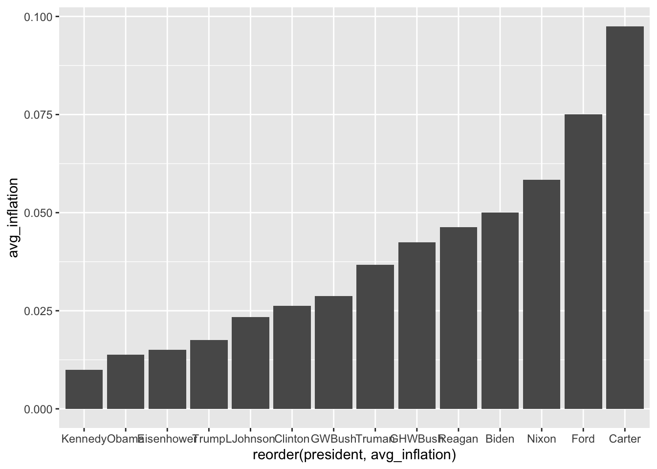
6.4.3 Horizontal Bars
# Flip coordinates for readability
ggplot(president_inflation, aes(x = reorder(president, avg_inflation),
                                 y = avg_inflation)) +
  geom_col(fill = "steelblue") +
  coord_flip()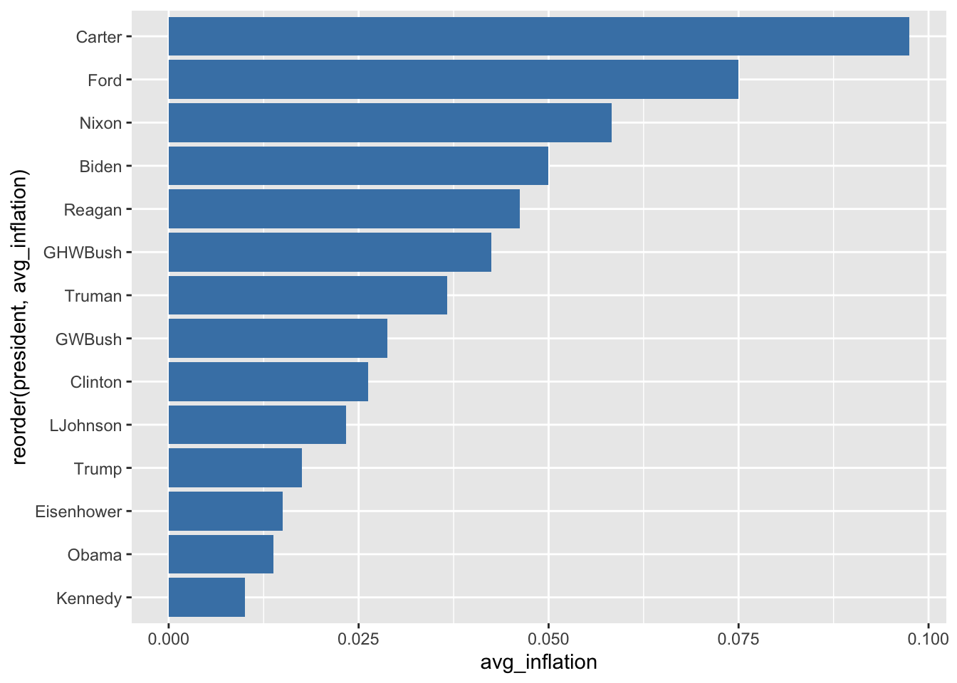
6.4.4 Colored Bars
# Color based on value
ggplot(president_inflation, aes(x = reorder(president, avg_inflation),
                                 y = avg_inflation,
                                 fill = avg_inflation)) +
  geom_col() +
  coord_flip() +
  scale_fill_gradient(low = "lightblue", high = "darkred")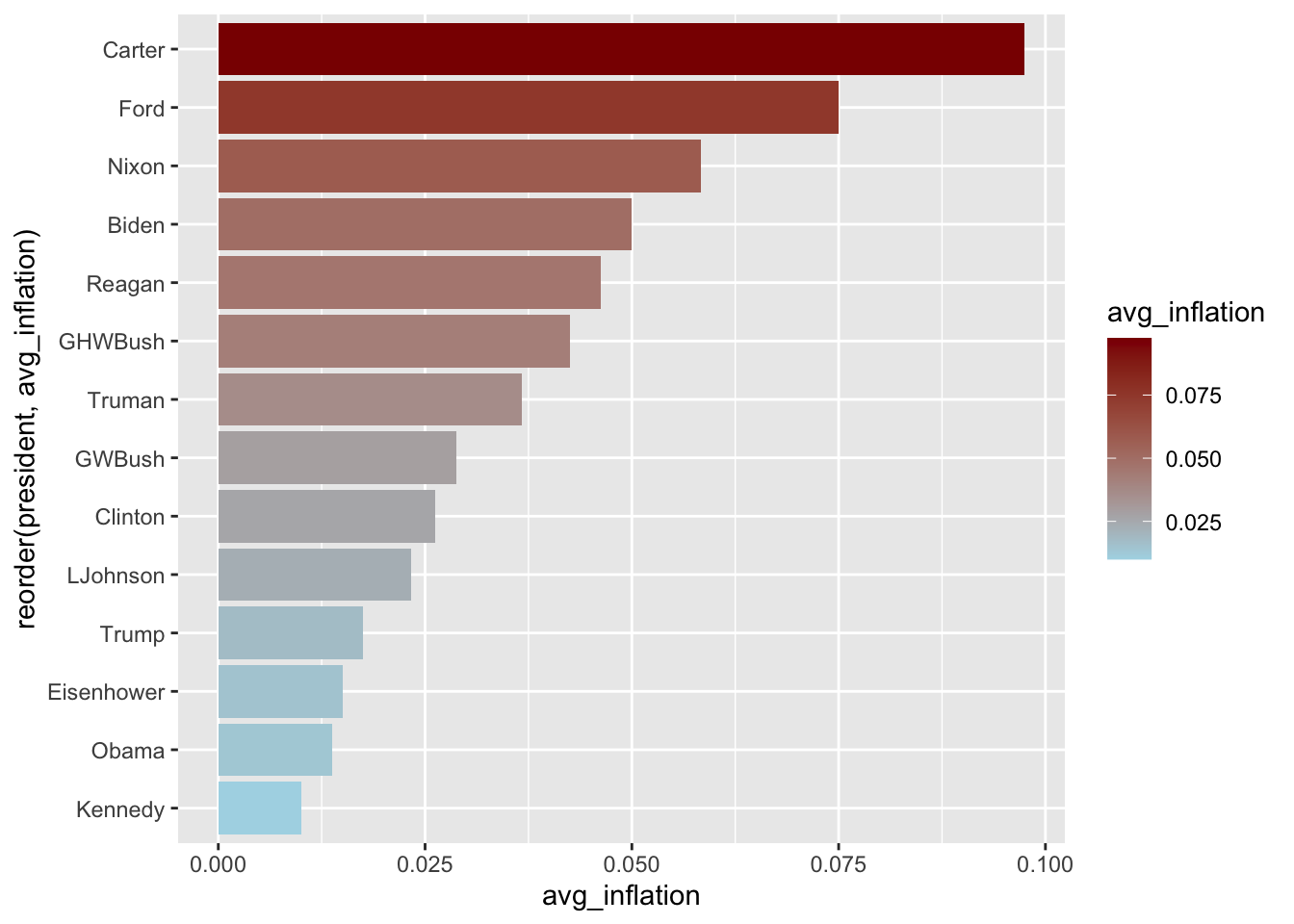
6.4.5 Grouped Bar Charts
# Compare inflation and unemployment by decade
decade_summary <- macro %>%
  filter(year >= 1950) %>%
  mutate(decade = paste0(floor(year / 10) * 10, "s")) %>%
  group_by(decade) %>%
  summarize(
    Inflation = mean(inflation, na.rm = TRUE) * 100,
    Unemployment = mean(unemployment, na.rm = TRUE) * 100
  ) %>%
  pivot_longer(cols = c(Inflation, Unemployment),
               names_to = "indicator",
               values_to = "rate")

ggplot(decade_summary, aes(x = decade, y = rate, fill = indicator)) +
  geom_col(position = "dodge")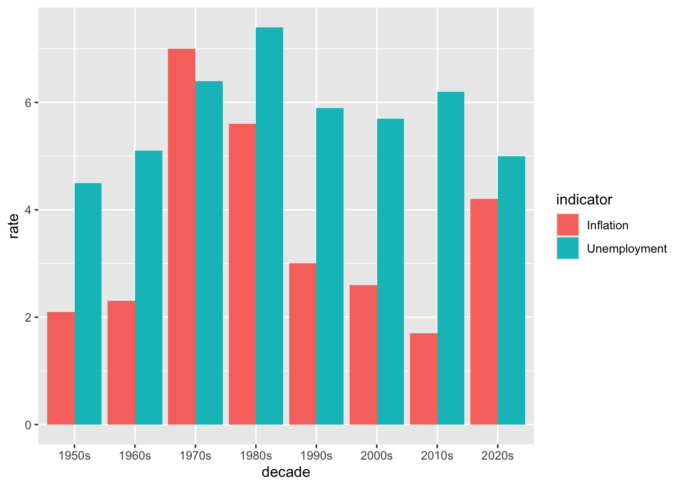
6.5 Histograms and Density Plots
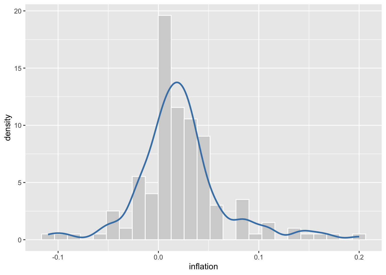
Histograms and density plots reveal the distribution of a single continuous variable—showing where values are concentrated, how spread out they are, and whether the distribution is symmetric or skewed. Histograms divide the data into bins and display the count (or proportion) of observations in each bin as bars. Density plots smooth over the bins to create a continuous curve that estimates the probability density function.
Understanding distributions is crucial in economics. The distribution of inflation rates tells you not just the average inflation, but how variable inflation has been and whether extreme episodes (like hyperinflation or deflation) are common or rare. Income distributions reveal inequality—a right-skewed distribution indicates many low earners and fewer high earners. Comparing distributions across groups or time periods can be revealing: has the distribution of unemployment rates become more or less dispersed since the 1980s? Overlaying density plots for different eras on the same axes makes such comparisons visually intuitive. The shape of a distribution also informs statistical analysis—many techniques assume normally distributed data, and these plots help you assess whether that assumption is reasonable.
6.5.1 Histograms
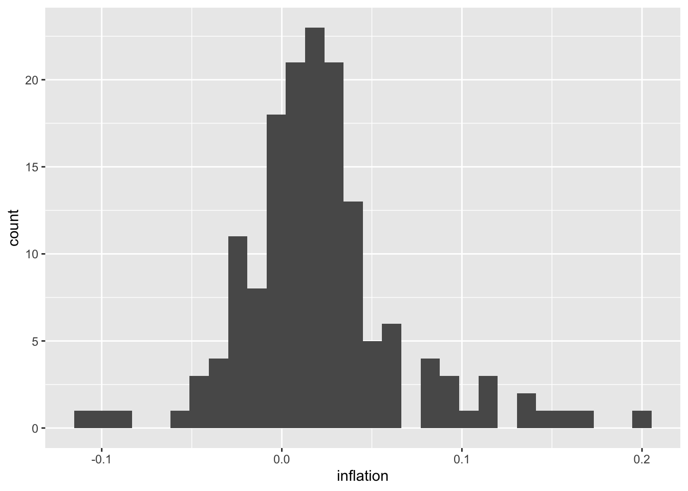
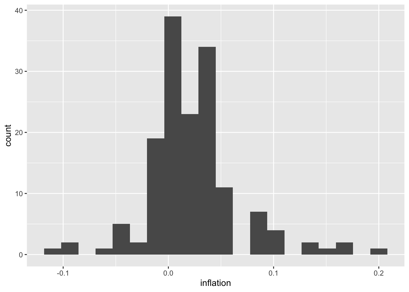
# Adjust bin width
ggplot(macro, aes(x = inflation)) +
  geom_histogram(binwidth = 0.02, fill = "steelblue", color = "white")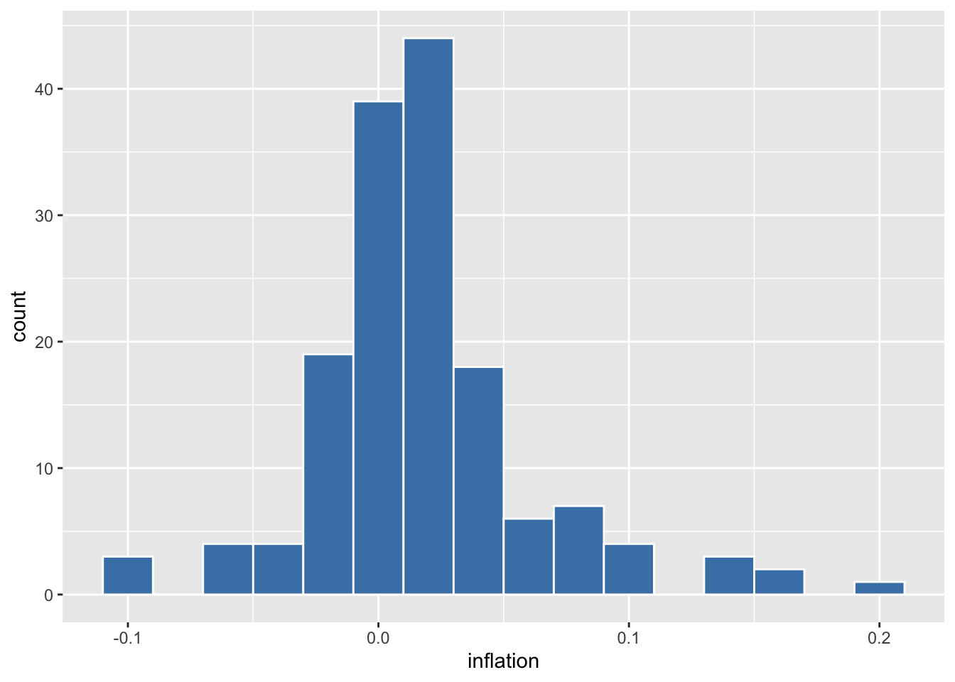
6.5.2 Density Plots
# Smooth density estimate
ggplot(macro, aes(x = inflation)) +
  geom_density(fill = "steelblue", alpha = 0.5)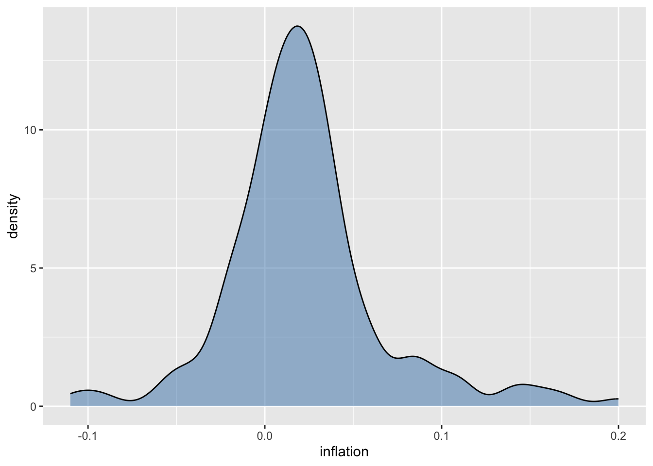
# Compare distributions by era
macro <- macro %>%
  mutate(era = case_when(
    year < 1945 ~ "Pre-WWII",
    year < 1980 ~ "1945-1979",
    TRUE ~ "1980-Present"
  ))

ggplot(macro, aes(x = inflation, fill = era)) +
  geom_density(alpha = 0.5)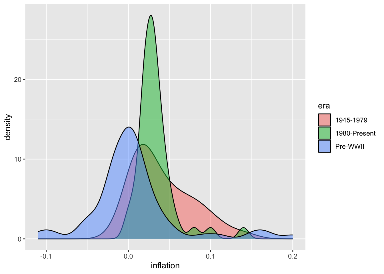
6.6 Box Plots
Box plots (also called box-and-whisker plots) provide a compact summary of a distribution using five key statistics: the median (center line), the first and third quartiles (the box edges, containing the middle 50% of data), and the whiskers extending to show the range of typical values. Points beyond the whiskers are displayed individually as potential outliers. This standardized format makes it easy to compare distributions across multiple groups at a glance.
Box plots are particularly valuable in economics when comparing the same variable across different categories or time periods. You might compare the distribution of GDP growth rates across countries, wage distributions across industries, or inflation variability across decades. Unlike histograms, which require substantial space to display one distribution, box plots can show many distributions side by side. They immediately reveal differences in central tendency (are the medians different?), spread (are some distributions more variable?), and skewness (is the median closer to the top or bottom of the box?). The explicit display of outliers is useful for identifying unusual economic episodes—recessions, financial crises, or policy experiments—that produced extreme values.
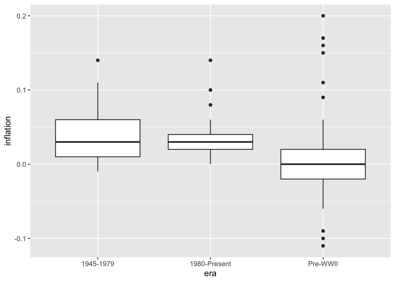
# Add individual points
ggplot(macro, aes(x = era, y = inflation)) +
  geom_boxplot(outlier.shape = NA) +
  geom_jitter(width = 0.2, alpha = 0.5)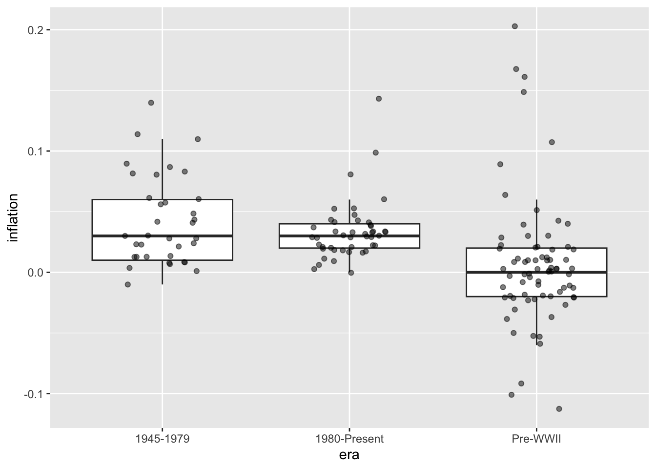
# Colored boxes
ggplot(macro, aes(x = era, y = inflation, fill = era)) +
  geom_boxplot() +
  theme(legend.position = "none")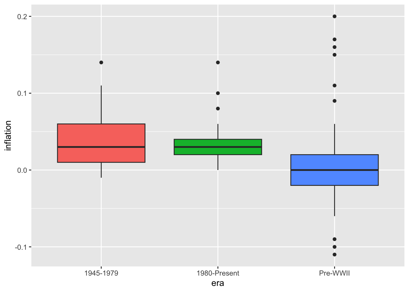
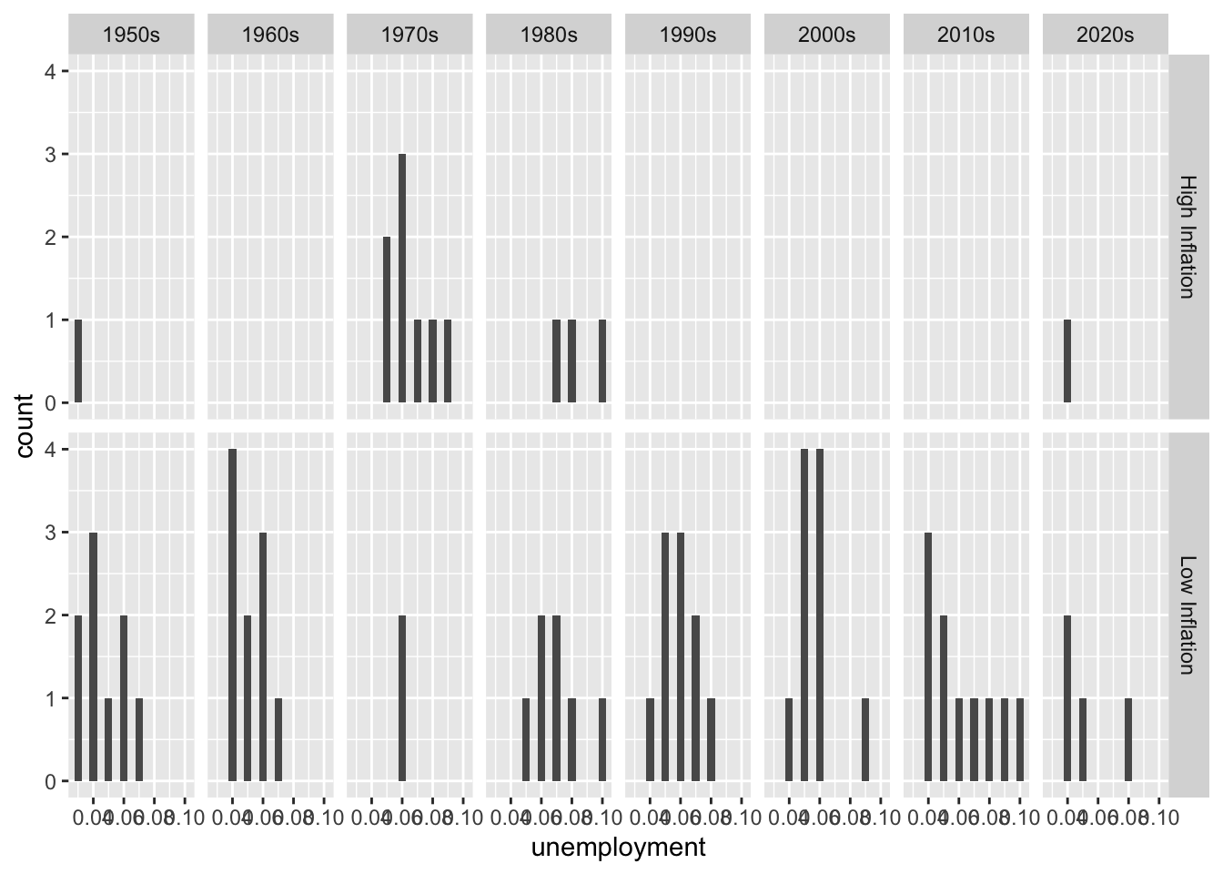
6.7 Faceting
Faceting (also known as small multiples or trellis plots) creates a grid of subplots, each showing the same type of chart for a different subset of the data. Rather than cramming all groups onto one plot with colors or shapes to distinguish them, faceting gives each group its own panel. This approach reduces visual clutter and makes patterns within each group clearer while still allowing comparisons across groups.
Faceting is powerful for economic analysis because it enables you to examine whether relationships hold consistently across different contexts. Does the Phillips Curve relationship between unemployment and inflation look the same in every decade, or has it changed over time? Do all countries show similar GDP growth patterns, or do some diverge? Faceted plots can reveal structural changes—perhaps the unemployment-inflation relationship was strong in the 1960s but weakened after the 1980s. The facet_wrap() function arranges panels in a flexible grid, while facet_grid() creates a more structured layout based on two categorical variables. Using consistent axes across panels (the default) facilitates direct comparisons; allowing scales to vary (scales = "free") can reveal patterns that would be hidden when a few extreme values dominate the axis range.
6.7.1 facet_wrap()
# Separate plots by decade
macro_postwar <- macro %>%
  filter(year >= 1950) %>%
  mutate(decade = paste0(floor(year / 10) * 10, "s"))

ggplot(macro_postwar, aes(x = unemployment, y = inflation)) +
  geom_point() +
  geom_smooth(method = "lm", se = FALSE) +
  facet_wrap(~ decade)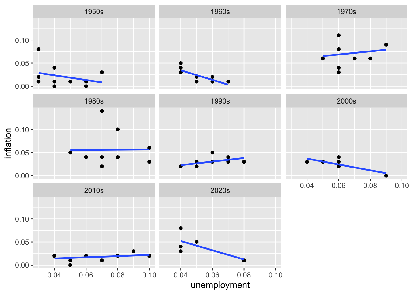
# Adjust layout
ggplot(macro_postwar, aes(x = unemployment, y = inflation)) +
  geom_point() +
  facet_wrap(~ decade, ncol = 2)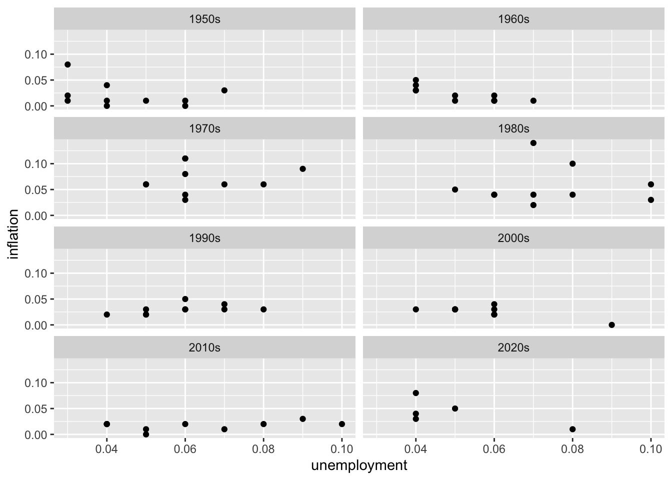
6.8 Customizing Plots
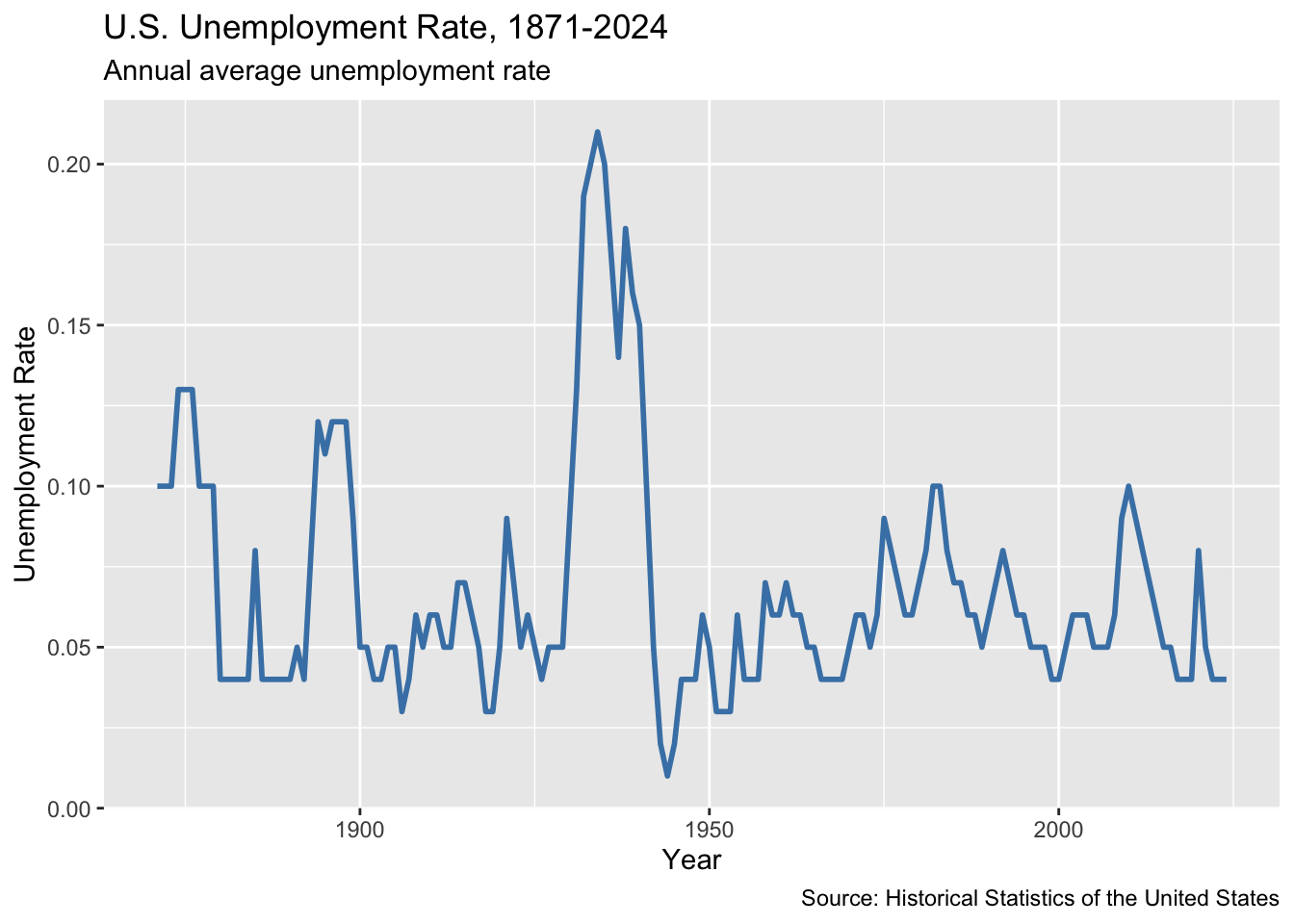
6.8.1 Titles and Labels
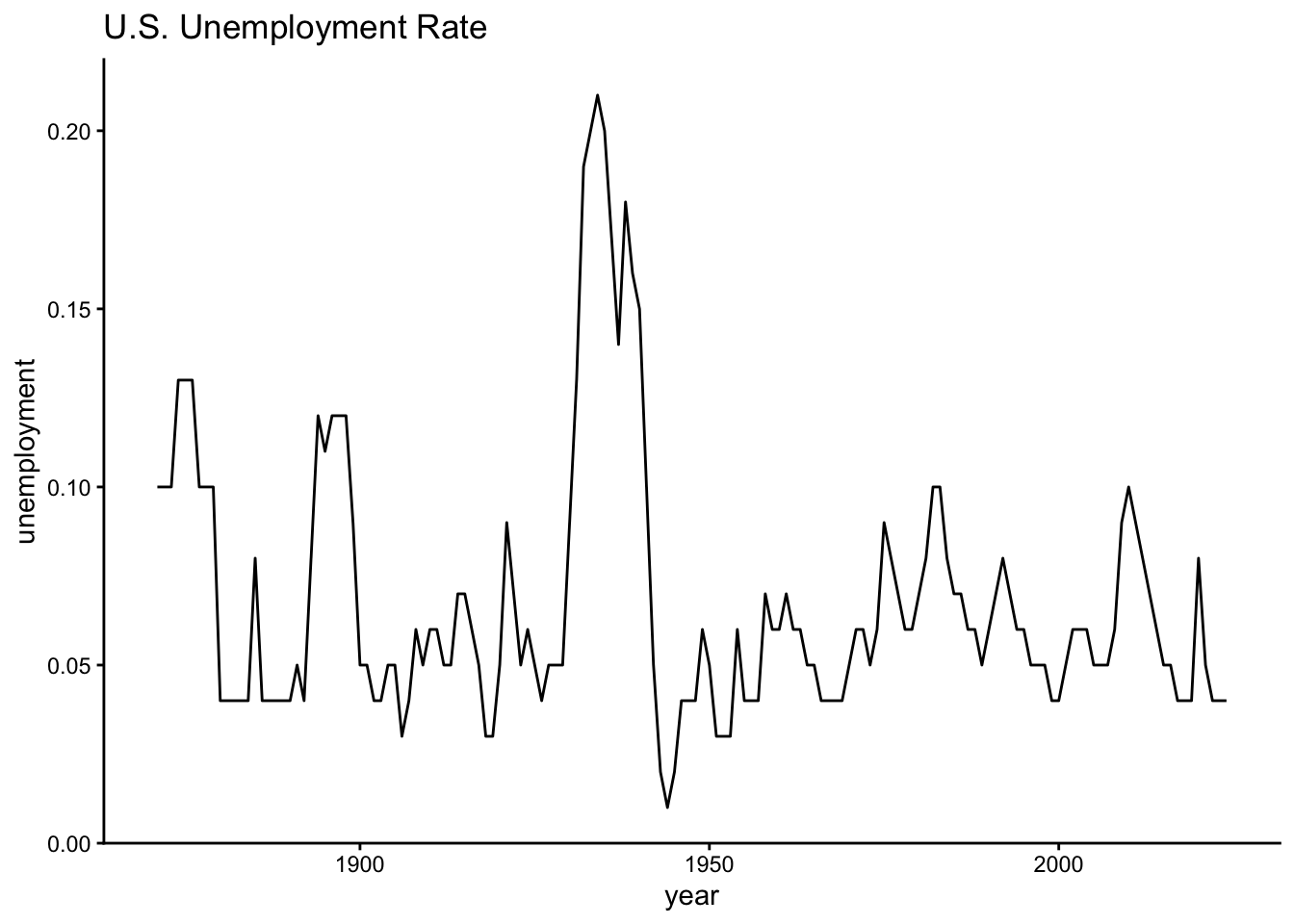
ggplot(macro, aes(x = year, y = unemployment)) +
  geom_line(color = "steelblue", linewidth = 1) +
  labs(
    title = "U.S. Unemployment Rate, 1871-2024",
    subtitle = "Annual average unemployment rate",
    x = "Year",
    y = "Unemployment Rate",
    caption = "Source: Historical Statistics of the United States"
  )
6.8.2 Axis Formatting
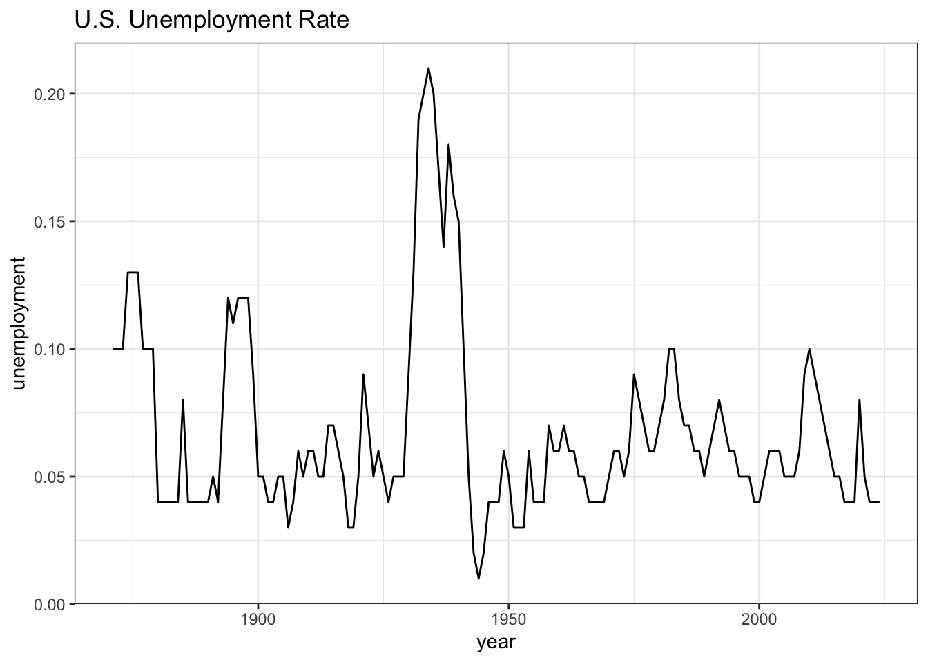
# Format as percentages
ggplot(macro, aes(x = year, y = unemployment)) +
  geom_line() +
  scale_y_continuous(labels = scales::percent_format())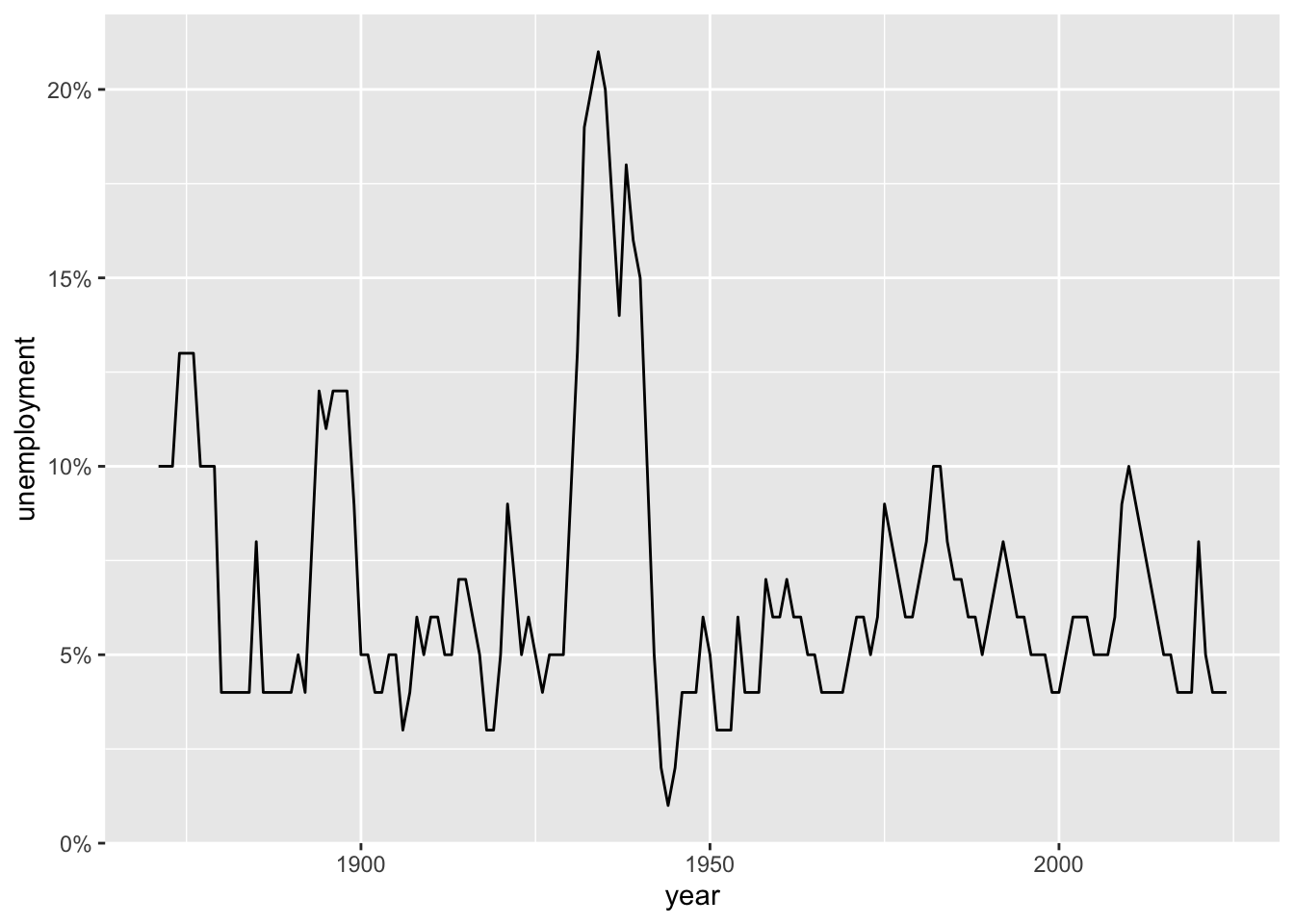
# Custom axis breaks
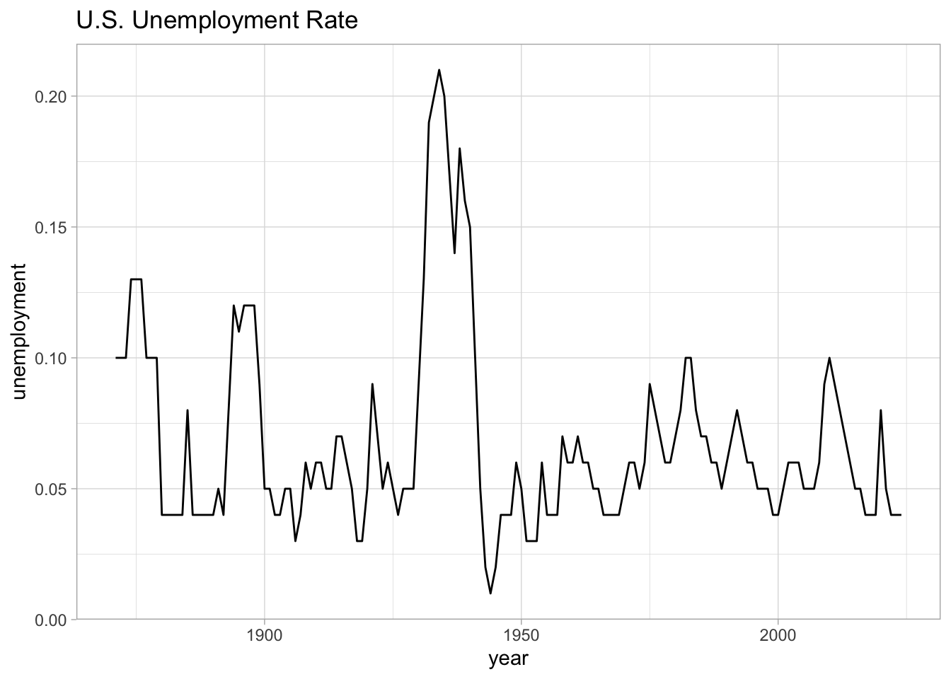
ggplot(macro, aes(x = year, y = unemployment)) +
geom_line() +
scale_x_continuous(breaks = seq(1880, 2020, by = 20)) +
scale_y_continuous(labels = scales::percent_format(),
breaks = seq(0, 0.25, by = 0.05))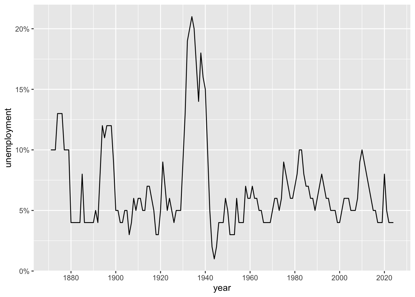
# Limit axis range
ggplot(macro, aes(x = year, y = unemployment)) +
  geom_line() +
  coord_cartesian(xlim = c(1950, 2024), ylim = c(0, 0.12))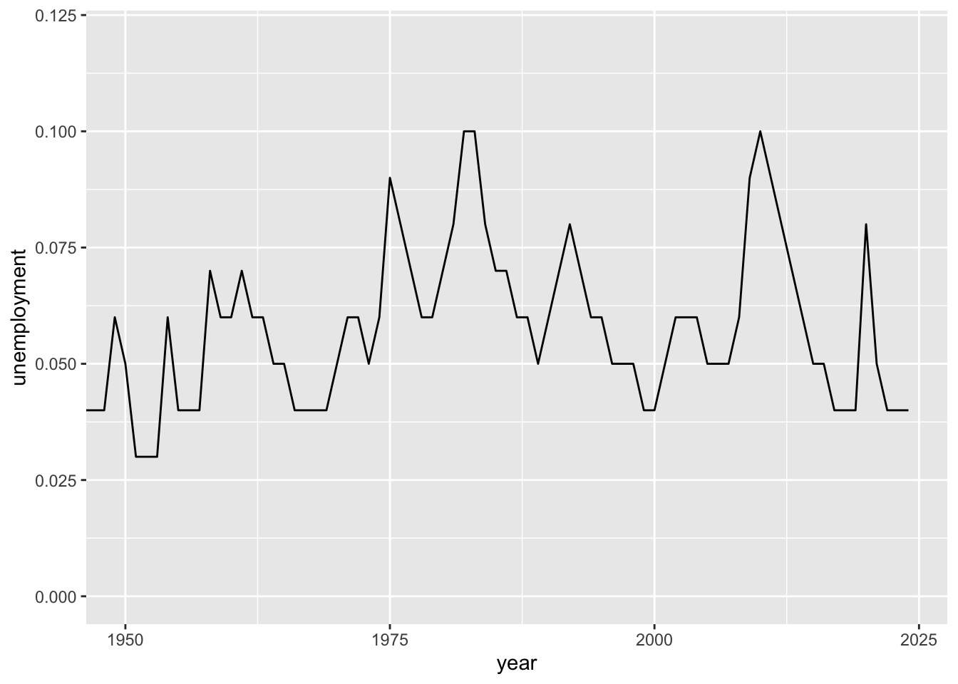
6.8.3 Color Scales
# Manual colors
ggplot(macro_postwar, aes(x = year, y = inflation, color = decade)) +
  geom_line(linewidth = 1) +
  scale_color_manual(values = c("1950s" = "#1b9e77", "1960s" = "#d95f02",
                                "1970s" = "#7570b3", "1980s" = "#e7298a",
                                "1990s" = "#66a61e", "2000s" = "#e6ab02",
                                "2010s" = "#a6761d", "2020s" = "#666666"))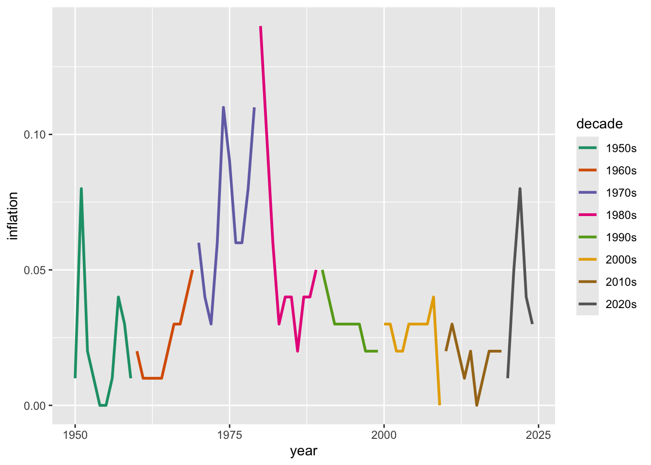
# Color brewer palettes
ggplot(macro_postwar, aes(x = unemployment, y = inflation, color = decade)) +
  geom_point(size = 2) +
  scale_color_brewer(palette = "Set1")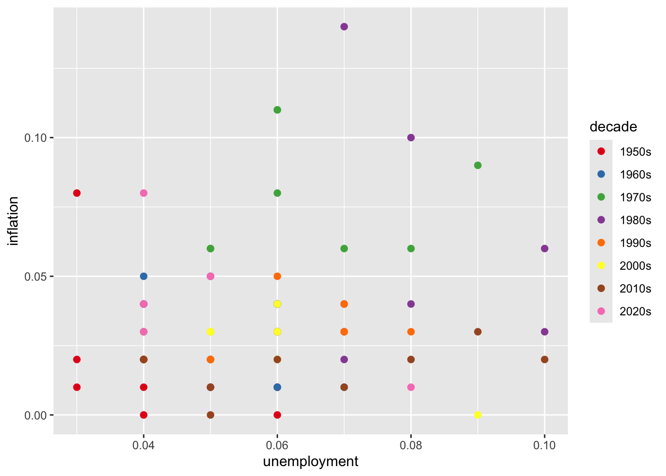
# Viridis (colorblind-friendly)
ggplot(macro_postwar, aes(x = unemployment, y = inflation, color = decade)) +
  geom_point(size = 2) +
  scale_color_viridis_d()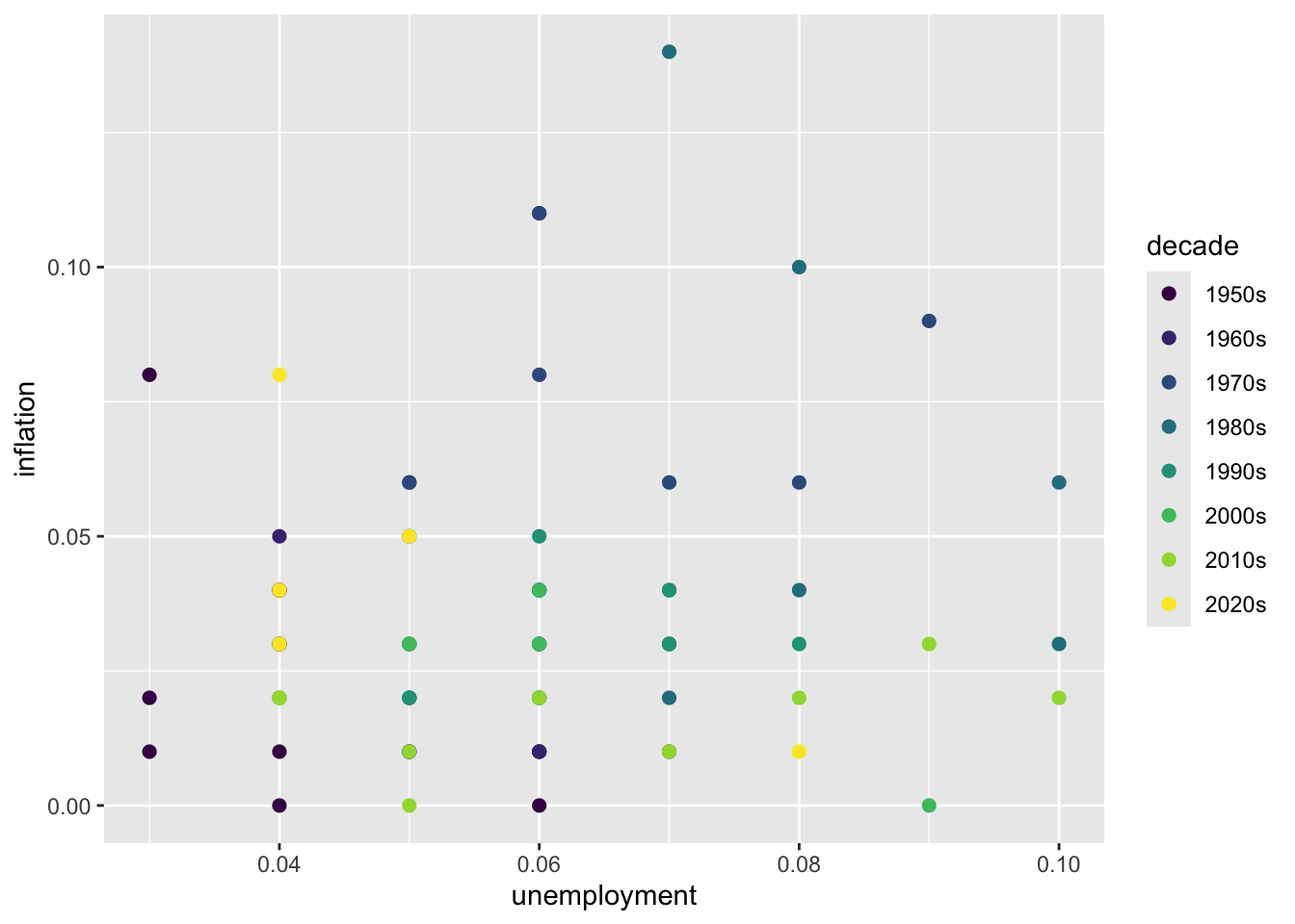
6.8.4 Themes
# Built-in themes
p <- ggplot(macro, aes(x = year, y = unemployment)) +
  geom_line() +
  labs(title = "U.S. Unemployment Rate")

p + theme_minimal()
p + theme_classic()
p + theme_bw()
p + theme_light()
# Customize theme elements
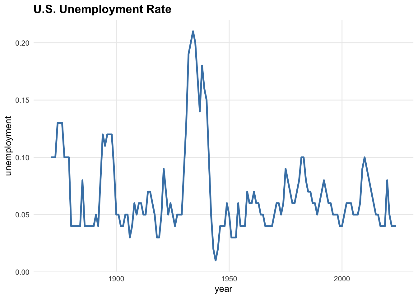
ggplot(macro, aes(x = year, y = unemployment)) +
geom_line(color = "steelblue", linewidth = 1) +
labs(title = "U.S. Unemployment Rate") +
theme_minimal() +
theme(
plot.title = element_text(face = "bold", size = 14),
axis.title = element_text(size = 11),
panel.grid.minor = element_blank()
)
6.9 Combining Multiple Plots
Use the patchwork package to arrange multiple plots:
library(patchwork)

p1 <- ggplot(macro, aes(x = year, y = unemployment)) +
  geom_line() +
  labs(title = "Unemployment")

p2 <- ggplot(macro, aes(x = year, y = inflation)) +
  geom_line() +
  labs(title = "Inflation")

p3 <- ggplot(macro, aes(x = unemployment, y = inflation)) +
  geom_point() +
  labs(title = "Phillips Curve")

# Complex layout
(p1 + p2) / p3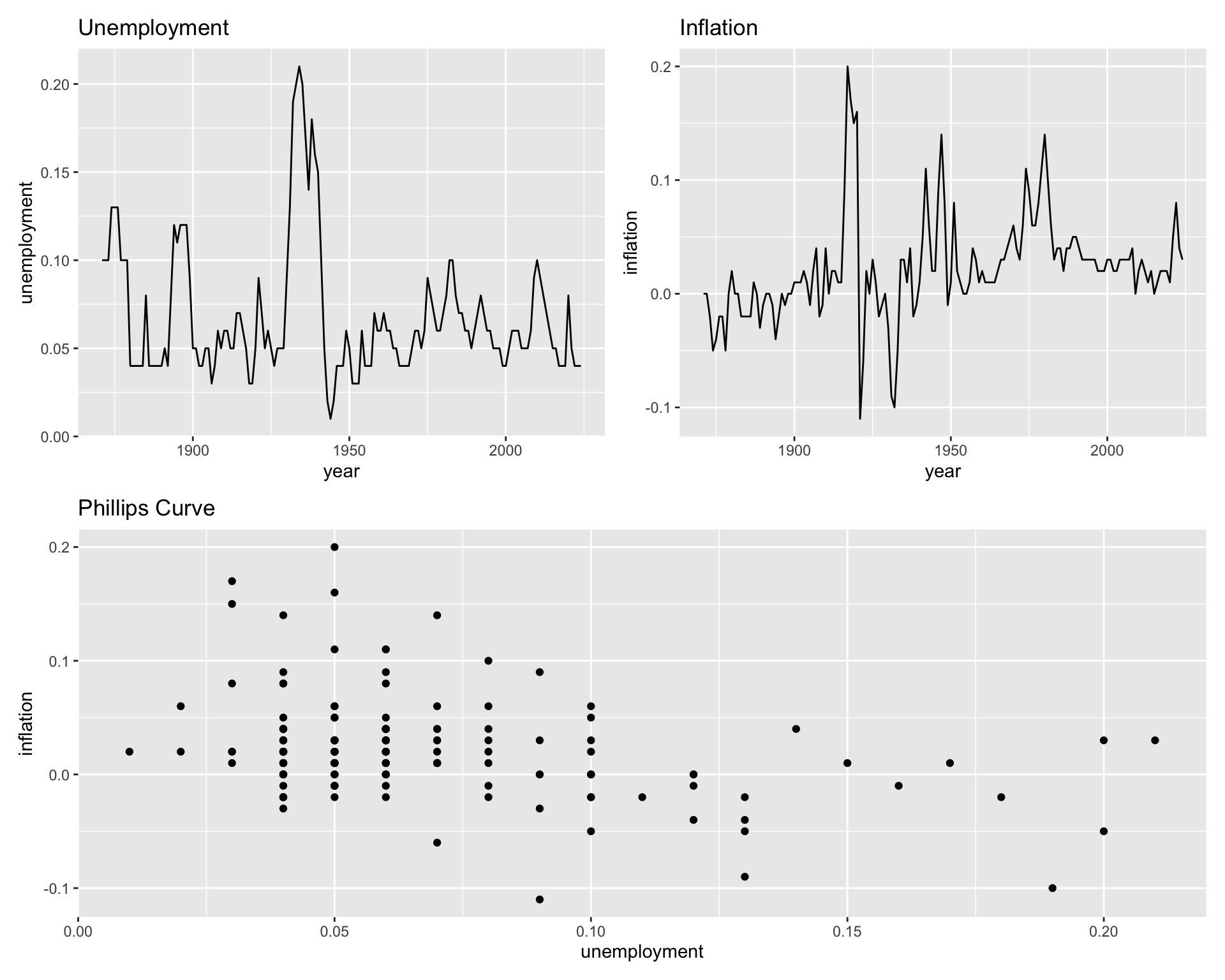
6.10 Saving Plots
# Create a plot
unemployment_plot <- ggplot(macro, aes(x = year, y = unemployment)) +
  geom_line(color = "steelblue", linewidth = 1) +
  labs(title = "U.S. Unemployment Rate, 1871-2024",
       x = "Year", y = "Unemployment Rate") +
  scale_y_continuous(labels = scales::percent_format()) +
  theme_minimal()

# Save to file
ggsave("unemployment_plot.png", unemployment_plot,
       width = 10, height = 6, dpi = 300)

ggsave("unemployment_plot.pdf", unemployment_plot,
       width = 10, height = 6)
6.11 Example: Economic Dashboard
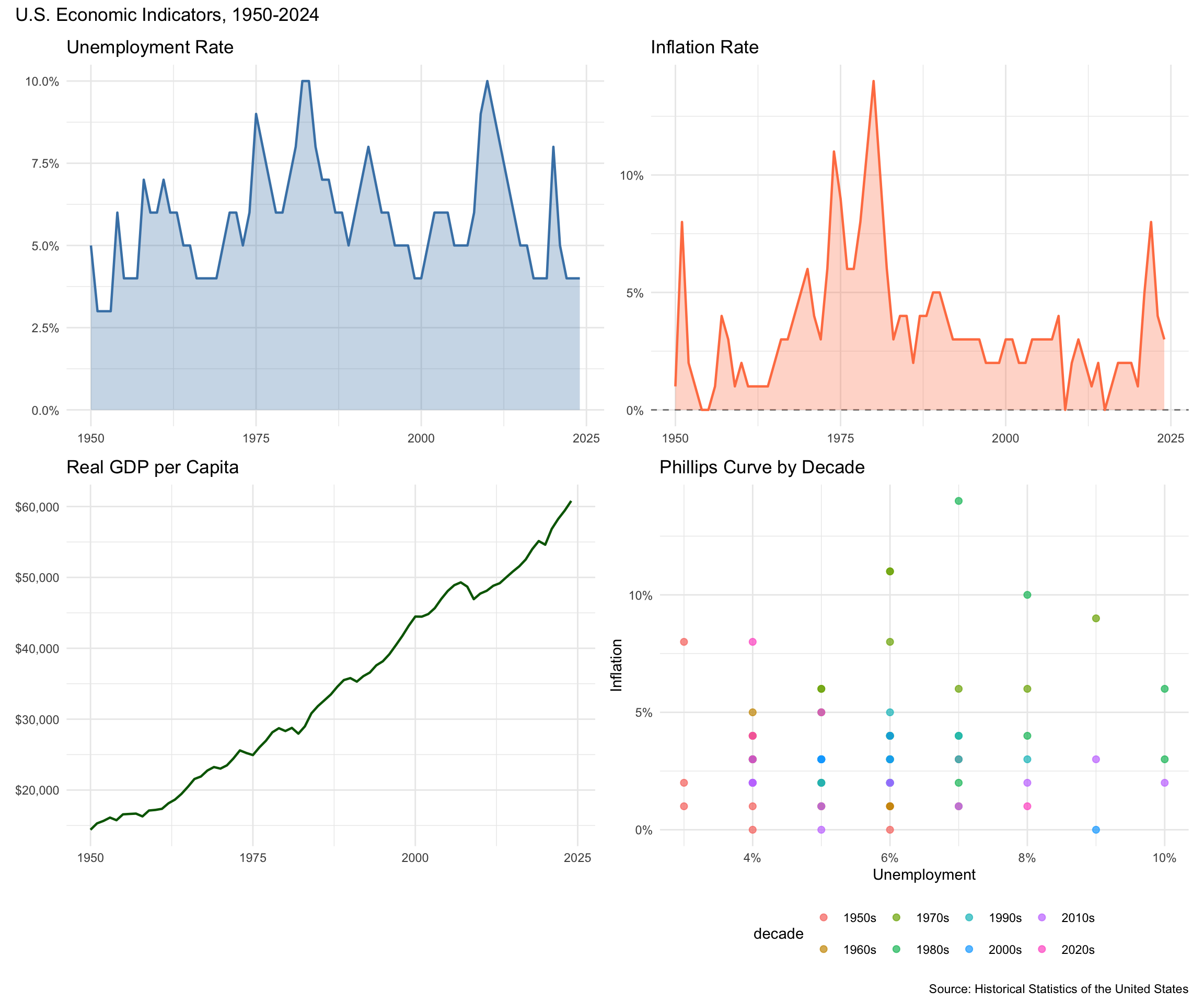
Let’s create a comprehensive visualization of US economic history:
library(patchwork)

macro_dash <- read_csv("data/us_macrodata.csv") %>%
  filter(year >= 1950) %>%
  mutate(decade = factor(paste0(floor(year / 10) * 10, "s")))

# Unemployment over time
p_unemployment <- ggplot(macro_dash, aes(x = year, y = unemployment)) +
  geom_area(fill = "steelblue", alpha = 0.3) +
  geom_line(color = "steelblue", linewidth = 0.8) +
  scale_y_continuous(labels = scales::percent_format()) +
  labs(title = "Unemployment Rate", x = NULL, y = NULL) +
  theme_minimal()

# Inflation over time
p_inflation <- ggplot(macro_dash, aes(x = year, y = inflation)) +
  geom_hline(yintercept = 0, linetype = "dashed", color = "gray50") +
  geom_area(fill = "coral", alpha = 0.3) +
  geom_line(color = "coral", linewidth = 0.8) +
  scale_y_continuous(labels = scales::percent_format()) +
  labs(title = "Inflation Rate", x = NULL, y = NULL) +
  theme_minimal()

# Real GDP per capita
p_gdp <- ggplot(macro_dash, aes(x = year, y = realgdp_percap)) +
  geom_line(color = "darkgreen", linewidth = 0.8) +
  scale_y_continuous(labels = scales::dollar_format()) +
  labs(title = "Real GDP per Capita", x = NULL, y = NULL) +
  theme_minimal()

# Phillips Curve by decade
p_phillips <- ggplot(macro_dash, aes(x = unemployment, y = inflation, color = decade)) +
  geom_point(size = 2, alpha = 0.7) +
  scale_x_continuous(labels = scales::percent_format()) +
  scale_y_continuous(labels = scales::percent_format()) +
  labs(title = "Phillips Curve by Decade", x = "Unemployment", y = "Inflation") +
  theme_minimal() +
  theme(legend.position = "bottom")

# Combine into dashboard
(p_unemployment + p_inflation) / (p_gdp + p_phillips) +
  plot_annotation(
    title = "U.S. Economic Indicators, 1950-2024",
    caption = "Source: Historical Statistics of the United States"
  )
6.12 Example: State-Level Comparisons
The state-level ACS data is ideal for cross-sectional comparisons and exploring relationships between state characteristics.
# Load state data
states <- read_csv("data/acs_state.csv")

# Education vs. Income relationship
ggplot(states %>% filter(state != "Puerto Rico"),
       aes(x = bachelors_or_higher, y = median_household_income)) +
  geom_point(aes(size = population), alpha = 0.6) +
  geom_smooth(method = "lm", se = FALSE, color = "steelblue") +
  scale_x_continuous(labels = scales::percent_format()) +
  scale_y_continuous(labels = scales::dollar_format()) +
  scale_size_continuous(labels = scales::comma_format(), range = c(2, 12)) +
  labs(
    title = "Education and Income Across States",
    x = "% with Bachelor's Degree or Higher",
    y = "Median Household Income",
    size = "Population"
  ) +
  theme_minimal()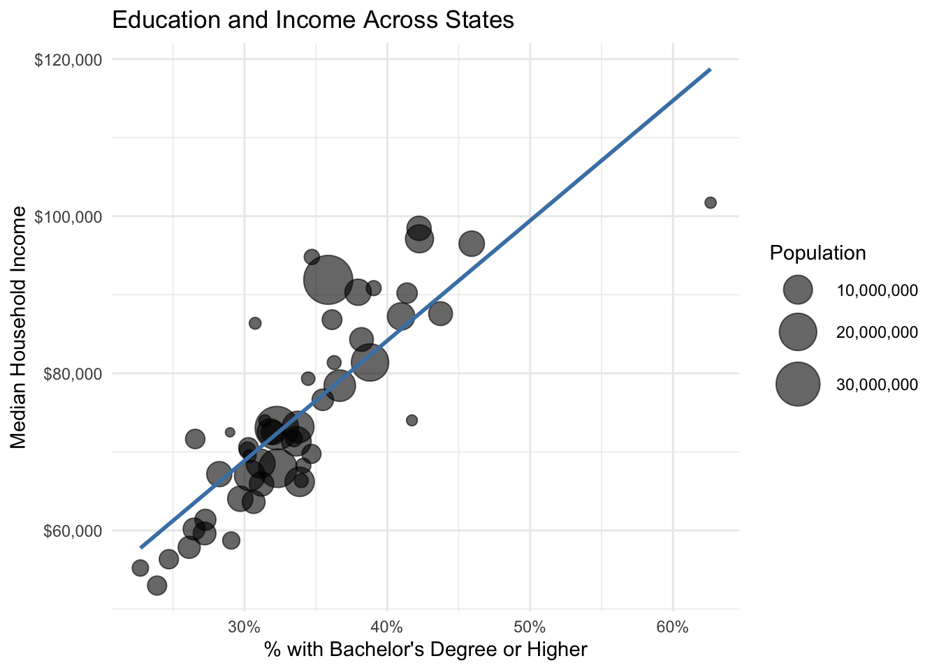
# Top 10 states by median income
states %>%
  filter(state != "Puerto Rico") %>%
  slice_max(median_household_income, n = 10) %>%
  ggplot(aes(x = reorder(state, median_household_income), y = median_household_income)) +
  geom_col(fill = "steelblue") +
  geom_text(aes(label = scales::dollar(median_household_income)),
            hjust = -0.1, size = 3) +
  scale_y_continuous(labels = scales::dollar_format(), expand = c(0, 0, 0.15, 0)) +
  coord_flip() +
  labs(
    title = "Top 10 States by Median Household Income",
    x = NULL, y = "Median Household Income"
  ) +
  theme_minimal()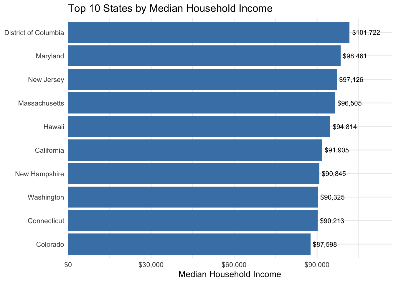
6.13 Example: Wage Distributions from PUMS
Individual-level microdata is well-suited for examining distributions and comparing groups.
# Load PUMS data
pums <- read_csv("data/acs_pums.csv")

# Distribution of wages for employed workers
pums %>%
  filter(employed == "Employed", wage_income > 0, wage_income < 200000) %>%
  ggplot(aes(x = wage_income)) +
  geom_histogram(bins = 50, fill = "steelblue", color = "white") +
  scale_x_continuous(labels = scales::dollar_format()) +
  labs(
    title = "Distribution of Wage Income",
    subtitle = "Employed workers with wages under $200,000",
    x = "Annual Wage Income", y = "Count"
  ) +
  theme_minimal()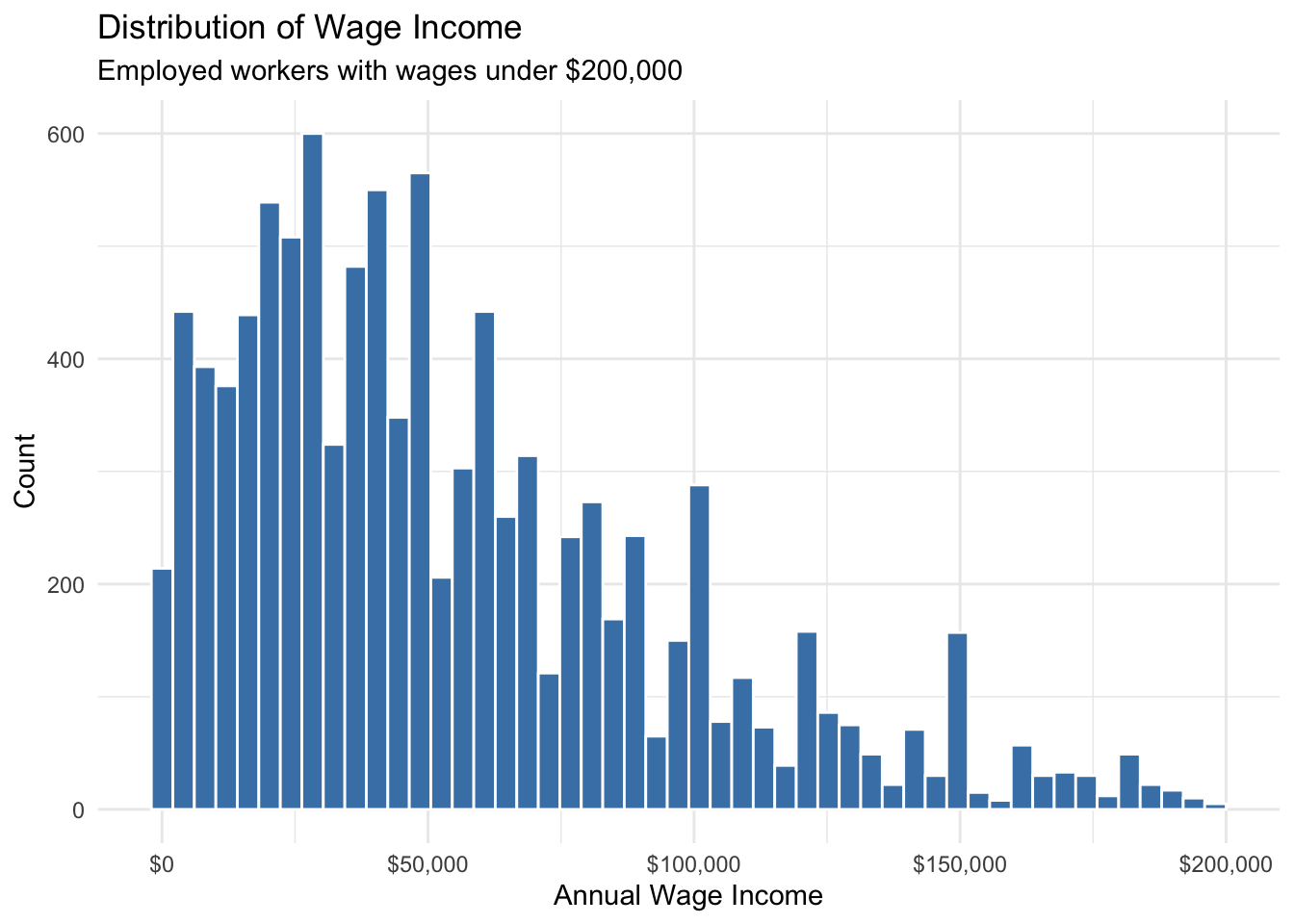
# Wage distributions by education
pums %>%
  filter(employed == "Employed", wage_income > 0, wage_income < 200000) %>%
  filter(education %in% c("High school", "Bachelors", "Masters")) %>%
  ggplot(aes(x = wage_income, fill = education)) +
  geom_density(alpha = 0.5) +
  scale_x_continuous(labels = scales::dollar_format()) +
  labs(
    title = "Wage Distribution by Education Level",
    x = "Annual Wage Income", y = "Density", fill = "Education"
  ) +
  theme_minimal()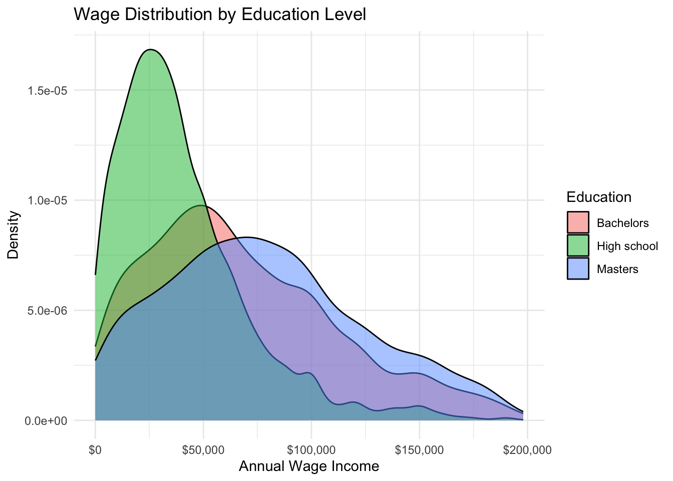
# Wages by state and sex
pums %>%
  filter(employed == "Employed", wage_income > 0) %>%
  ggplot(aes(x = state, y = wage_income, fill = sex)) +
  geom_boxplot(outlier.alpha = 0.3) +
  scale_y_continuous(labels = scales::dollar_format(), limits = c(0, 150000)) +
  labs(
    title = "Wage Distribution by State and Sex",
    x = NULL, y = "Annual Wage Income", fill = NULL
  ) +
  theme_minimal() +
  theme(legend.position = "top")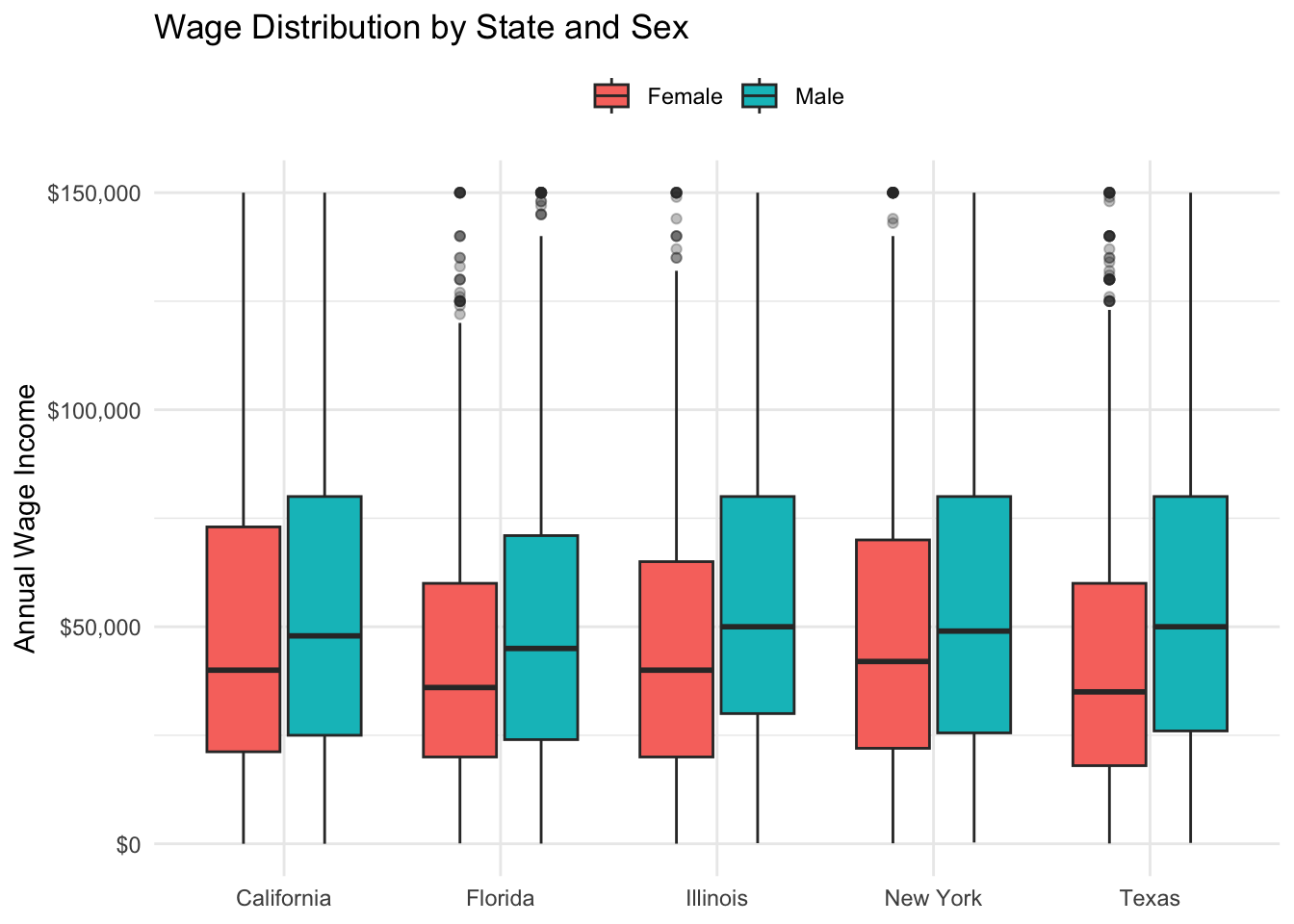
# Age-earnings profile
pums %>%
  filter(employed == "Employed", wage_income > 0, age >= 18, age <= 70) %>%
  mutate(has_degree = education %in% c("Bachelors", "Masters", "Professional/Doctorate")) %>%
  group_by(age, has_degree) %>%
  summarize(median_wage = median(wage_income), .groups = "drop") %>%
  ggplot(aes(x = age, y = median_wage, color = has_degree)) +
  geom_line(linewidth = 1) +
  scale_y_continuous(labels = scales::dollar_format()) +
  scale_color_manual(values = c("FALSE" = "coral", "TRUE" = "steelblue"),
                     labels = c("No Degree", "Bachelor's+")) +
  labs(
    title = "Age-Earnings Profile by Education",
    x = "Age", y = "Median Wage Income", color = NULL
  ) +
  theme_minimal() +
  theme(legend.position = "top")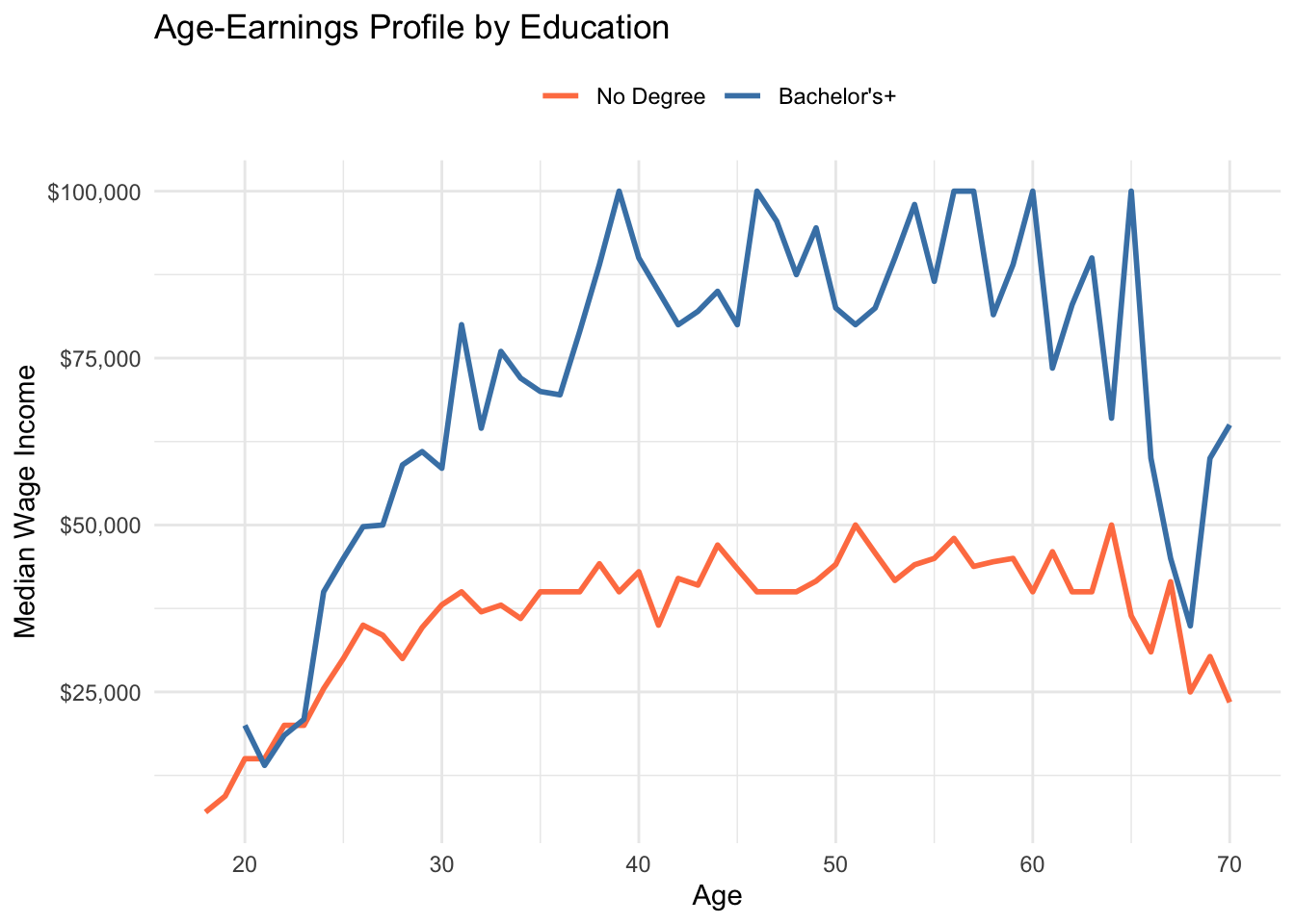
6.14 Example: Cafe Sales Analysis
Transaction data is ideal for time series analysis and examining business patterns.
# Load cafe data
cafe <- read_csv("data/cafe_sales.csv")

# Monthly revenue over time
cafe %>%
  mutate(year_month = floor_date(date, "month")) %>%
  group_by(year_month) %>%
  summarize(revenue = sum(price), .groups = "drop") %>%
  ggplot(aes(x = year_month, y = revenue)) +
  geom_line(color = "steelblue", linewidth = 0.8) +
  geom_smooth(method = "loess", se = FALSE, color = "coral", linetype = "dashed") +
  scale_y_continuous(labels = scales::dollar_format()) +
  labs(
    title = "Monthly Cafe Revenue (2019-2023)",
    subtitle = "With trend line showing COVID impact and recovery",
    x = NULL, y = "Monthly Revenue"
  ) +
  theme_minimal()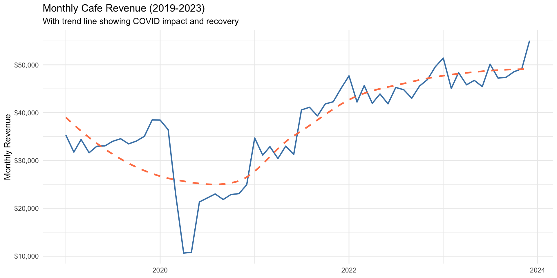
# Sales by day of week
cafe %>%
  mutate(day_of_week = factor(day_of_week,
         levels = c("Mon", "Tue", "Wed", "Thu", "Fri", "Sat", "Sun"))) %>%
  group_by(day_of_week) %>%
  summarize(avg_daily_revenue = sum(price) / n_distinct(date), .groups = "drop") %>%
  ggplot(aes(x = day_of_week, y = avg_daily_revenue, fill = day_of_week %in% c("Sat", "Sun"))) +
  geom_col() +
  scale_fill_manual(values = c("FALSE" = "steelblue", "TRUE" = "coral"), guide = "none") +
  scale_y_continuous(labels = scales::dollar_format()) +
  labs(
    title = "Average Daily Revenue by Day of Week",
    subtitle = "Weekend days highlighted",
    x = NULL, y = "Average Daily Revenue"
  ) +
  theme_minimal()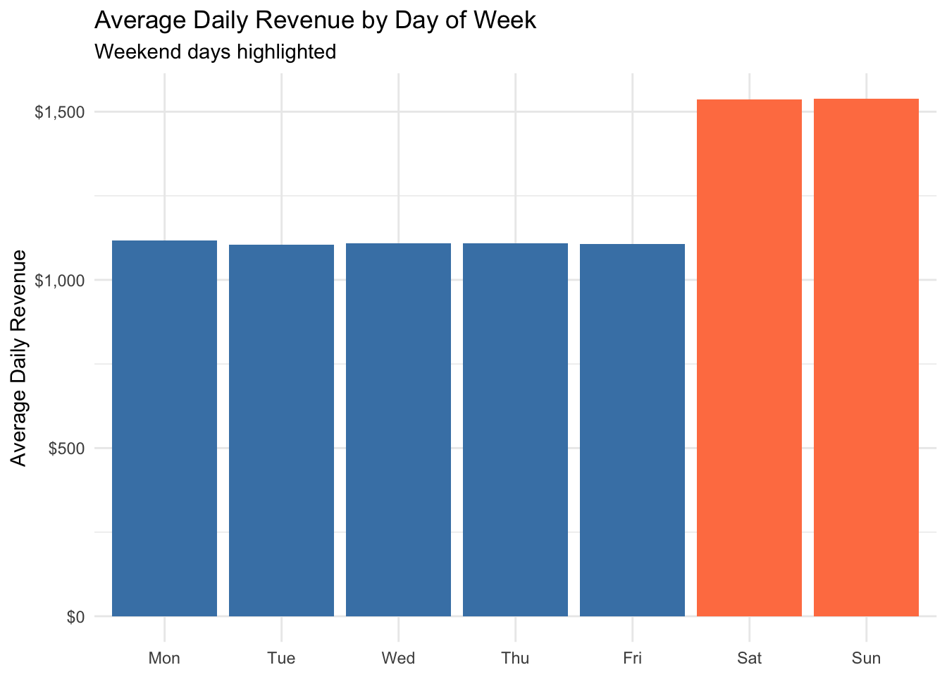
# Product sales comparison
cafe %>%
  group_by(product) %>%
  summarize(
    total_sales = n(),
    total_revenue = sum(price),
    .groups = "drop"
  ) %>%
  ggplot(aes(x = reorder(product, total_revenue), y = total_revenue, fill = product)) +
  geom_col() +
  geom_text(aes(label = scales::dollar(total_revenue)), hjust = -0.1) +
  scale_y_continuous(labels = scales::dollar_format(), expand = c(0, 0, 0.15, 0)) +
  coord_flip() +
  labs(title = "Total Revenue by Product (2019-2023)", x = NULL, y = "Total Revenue") +
  theme_minimal() +
  theme(legend.position = "none")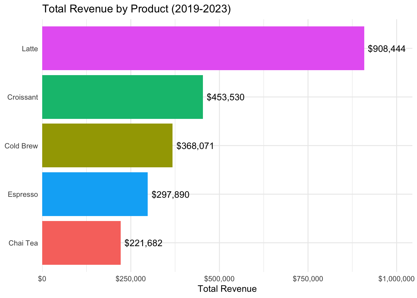
# Seasonal patterns by product
cafe %>%
  group_by(month, product) %>%
  summarize(sales = n(), .groups = "drop") %>%
  group_by(product) %>%
  mutate(pct_of_avg = sales / mean(sales) * 100 - 100) %>%
  ggplot(aes(x = factor(month), y = pct_of_avg, fill = pct_of_avg > 0)) +
  geom_col() +
  scale_fill_manual(values = c("FALSE" = "coral", "TRUE" = "steelblue"), guide = "none") +
  facet_wrap(~ product) +
  labs(
    title = "Seasonal Sales Patterns by Product",
    subtitle = "Percent deviation from average monthly sales",
    x = "Month", y = "% Above/Below Average"
  ) +
  theme_minimal()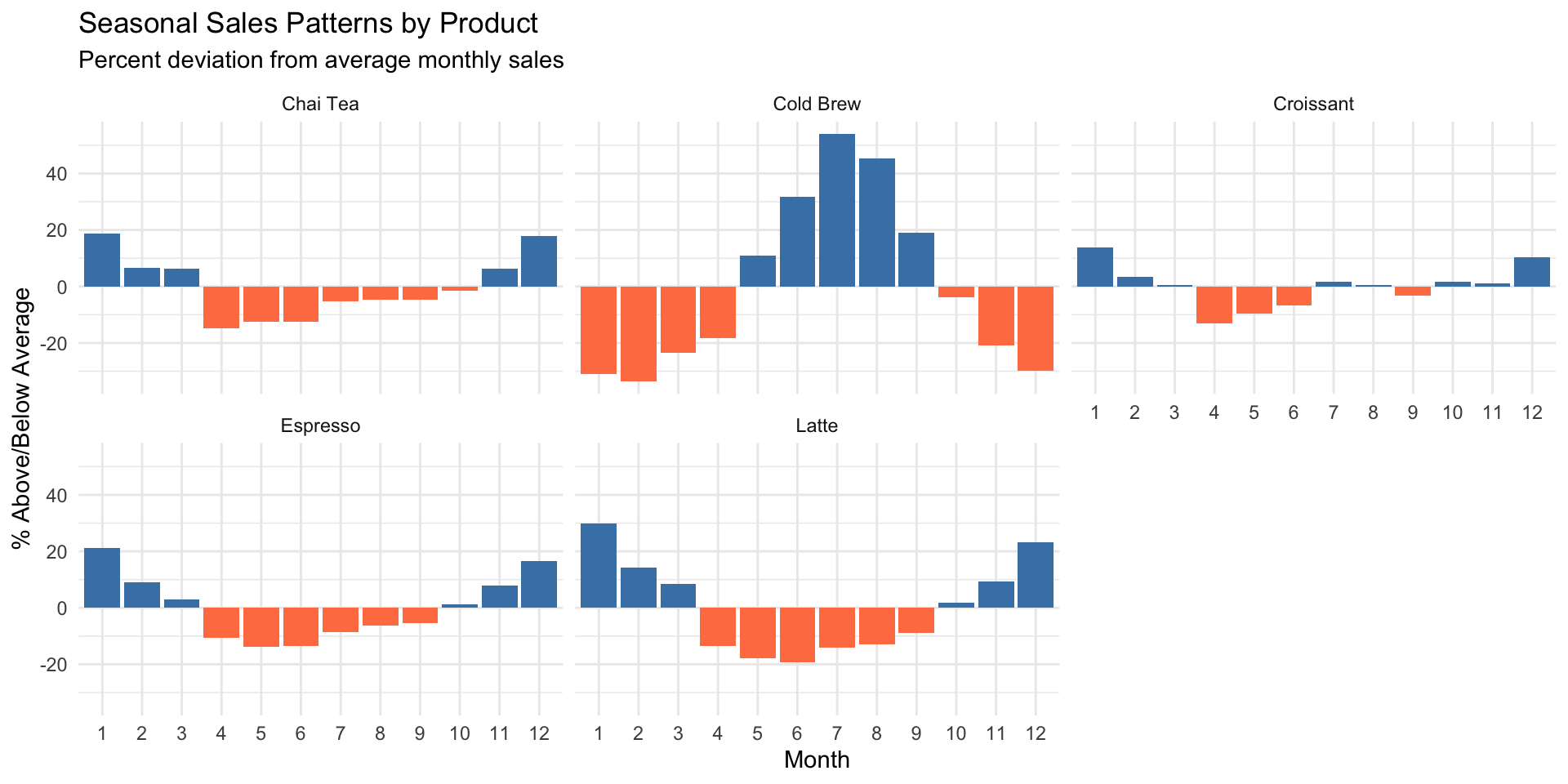
6.15 Exercises
Macro Data:
Create a line plot showing real GDP per capita from 1950 to present. Add a vertical line marking the 2008 financial crisis.
Make a scatter plot of unemployment vs. the S&P 500 index. Color the points by decade and add a trend line.
Create a histogram of inflation rates, with separate colors for positive and negative values.
State Data:
Create a scatter plot showing the relationship between poverty rate and unemployment rate across states. Add state labels to the points for states with poverty rates above 15%.
Make a bar chart showing the 10 states with the lowest homeownership rates. Color the bars by region (you’ll need to create a region variable).
Create a faceted plot comparing the distributions of median rent across different income tiers (high/medium/low income states).
PUMS Data:
Create a density plot comparing the age distribution of workers across the five states in the dataset.
Make a scatter plot showing the relationship between hours worked and wage income. Use transparency to handle overplotting, and add a trend line.
Create a bar chart showing median income by education level and sex (grouped bars).
Cafe Data:
Create a line plot showing daily sales over time for a single product of your choice. Add a smoothed trend line.
Make a heatmap showing average daily sales by day of week (rows) and month (columns).
Create a multi-panel visualization showing price trends, sales volume, and revenue for all products using patchwork.